About
Rebus Advertising is a digital marketing agency that aims to elevate local brands and small businesses through SEO, paid social, and eCommerce optimization. Businesses that have worked with Rebus are incredibly happy with the results they’ve experienced, making Rebus a powerhouse amongst similarly sized agencies.
The growth and success of the agency led the founding team to desire an updated brand, one that would signal to clients their legitimacy as experts in digital marketing. When I met Zach and Bryce, they were grateful for their Canva logo–but admitted it was time to move on to something bigger and better. Fortunately, they hired me to lead this rebrand.
Challenges
1. Design a wordmark and associated logomark/icon that would convey Rebus Advertising’s unique ability to transform and elevate small businesses.
2. Communicate the brand’s key value of being data-driven to deliver quality results, no matter the industry
3. Bring the new mark to life through event signage, business cards, and more.
Process
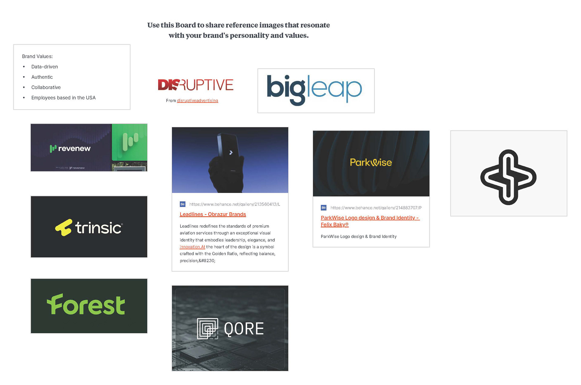
Visual References
From the references pictured below, I learned that Rebus wanted a logo that was minimal and futuristic. Through this collaborative "moodboard" method, I was better able to align myself with Rebus from a visual perspective.
Sketches
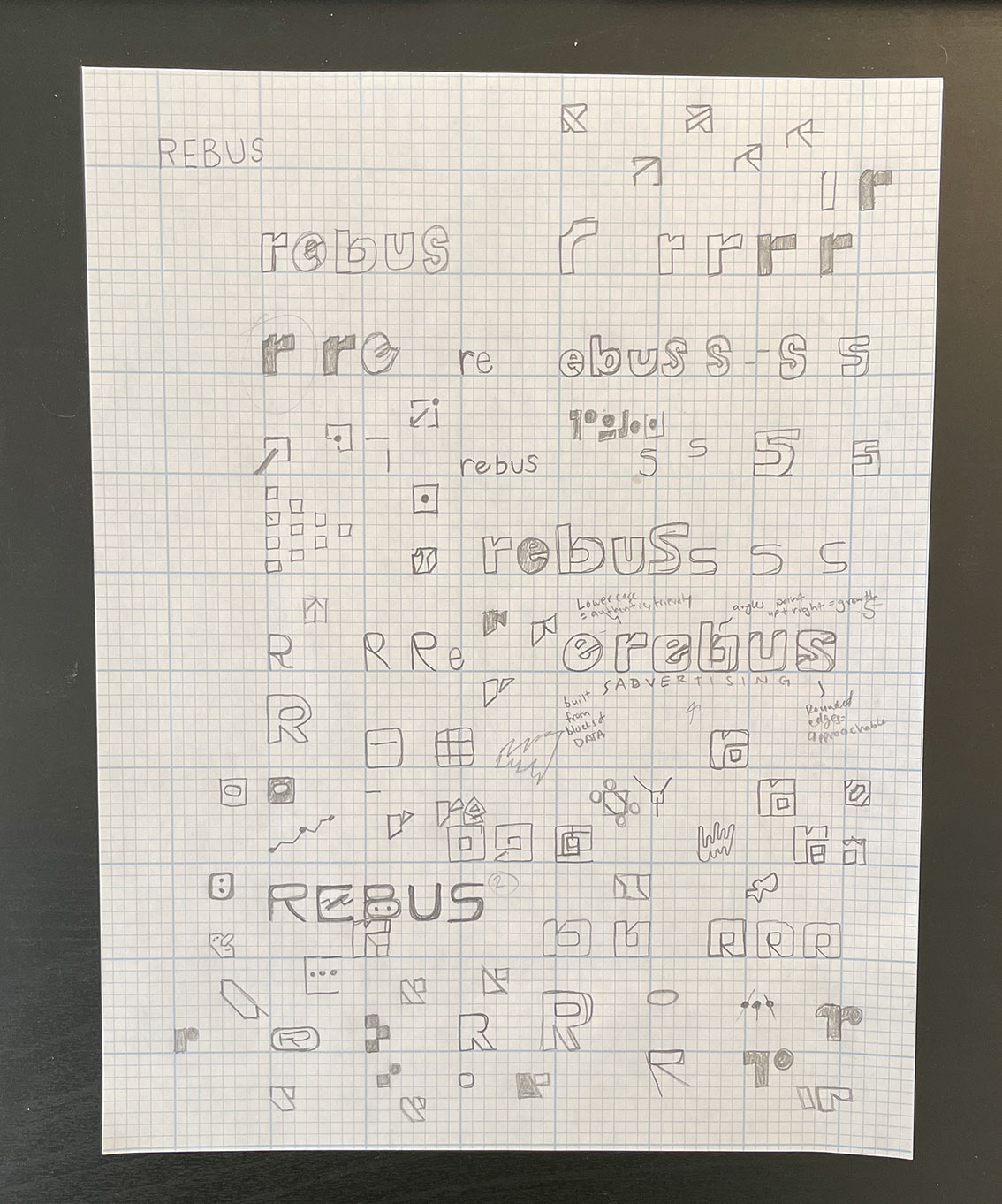
I doodled and sketched out a lot of ideas, working through various iterations of what the “R” would look like. I also experimented with custom typography for the wordmark.
Initial Concepts
For the initial design round, I presented three different concepts.
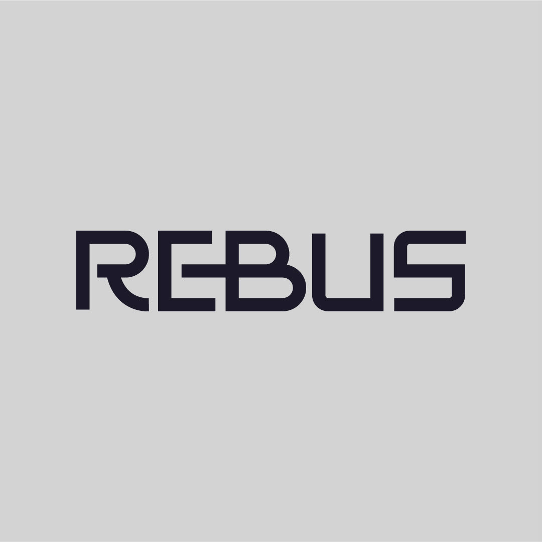
Concept 1
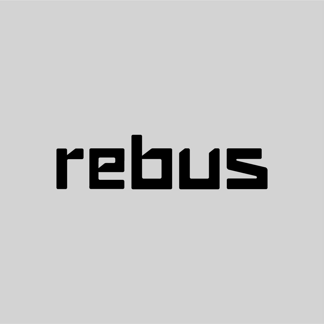
The first concept features custom type, designed to look futuristic and forward-thinking. I designed the “E” to connect with the “B” to bring in a sense of movement and connection. This concept is designed to feel modern and high-tech, while also evoking the trustworthiness of an experienced brand.
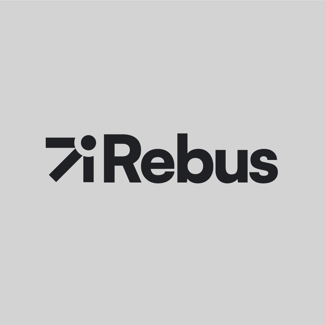
Concept 2
This concept features a sans serif wordmark combined with an abstract logomark. I intended this icon to represent a mouse pointer "clicking", signaling the purpose of working with Rebus: to get results. This concept, however, makes the name of the business read "iRebus", which adds confusion-not what I was hoping for.
Concept 3
This final concept also features custom typography. Though it does evokes a futuristic and modern feel, the lowercase letterforms help it feel more approachable. Each letterform started from a rounded square, giving it a blocky, modular style. I went with this approach to drive home the idea that Rebus is a data-driven agency.
Round 2
After presenting these concepts, option 1 was the winner. Round 2 was focused on creating an icon or logomark that could work both independent from and alongside the wordmark.
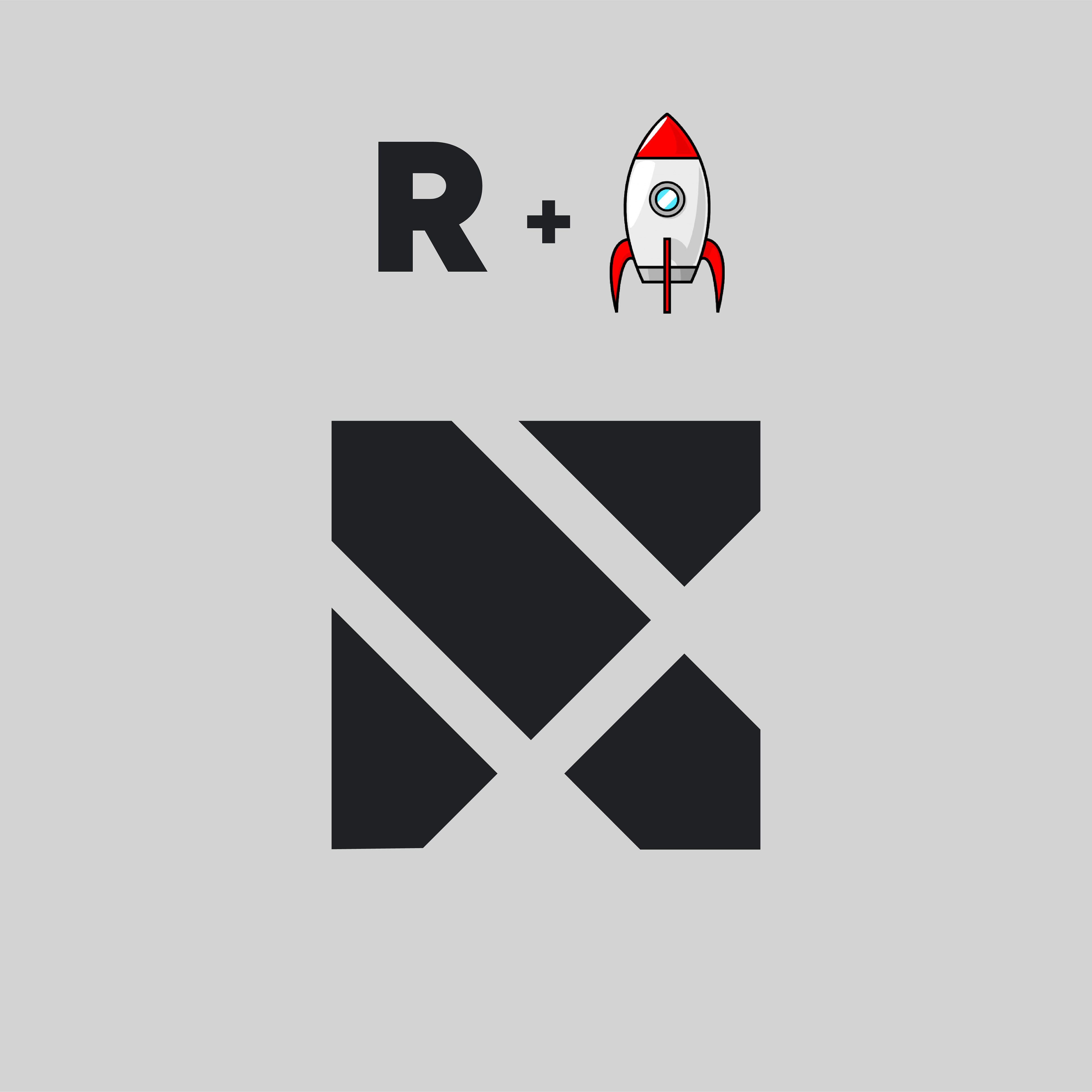
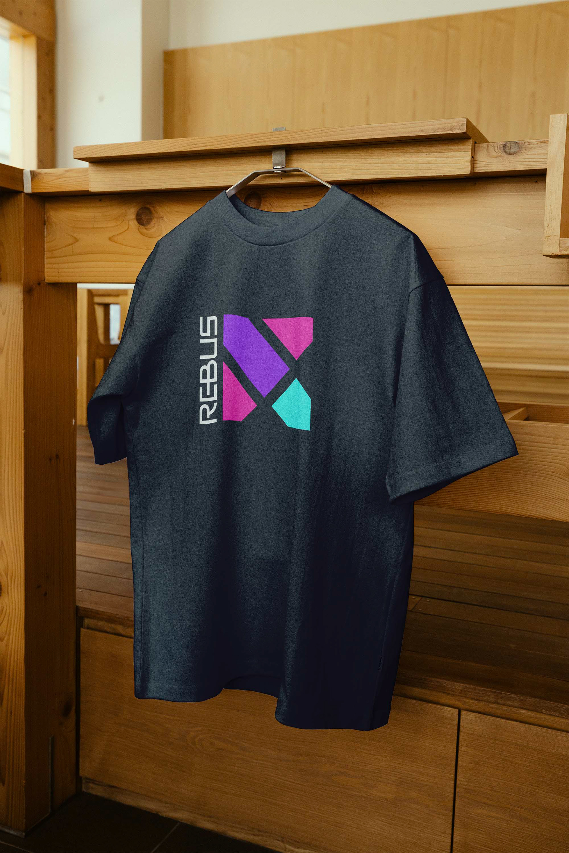
Going back to my sketchbook and thinking about ideas, I realized the concept was there all along: an abstract rocketship (representing growth, innovation) that also looked like a capitalized letter “R”. This mark achieved the two goals I had when creating it: be cohesive and be original.
Round 3
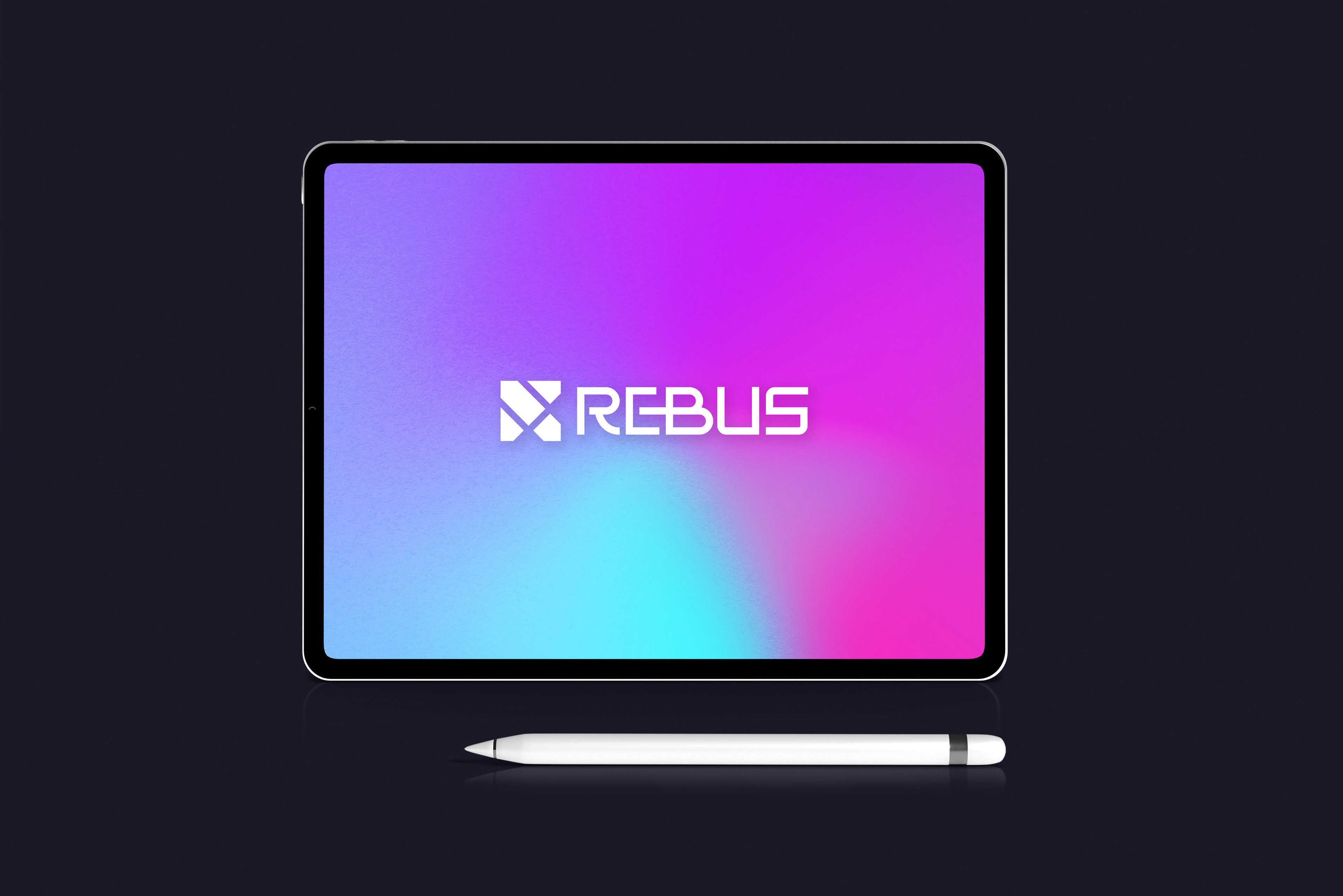
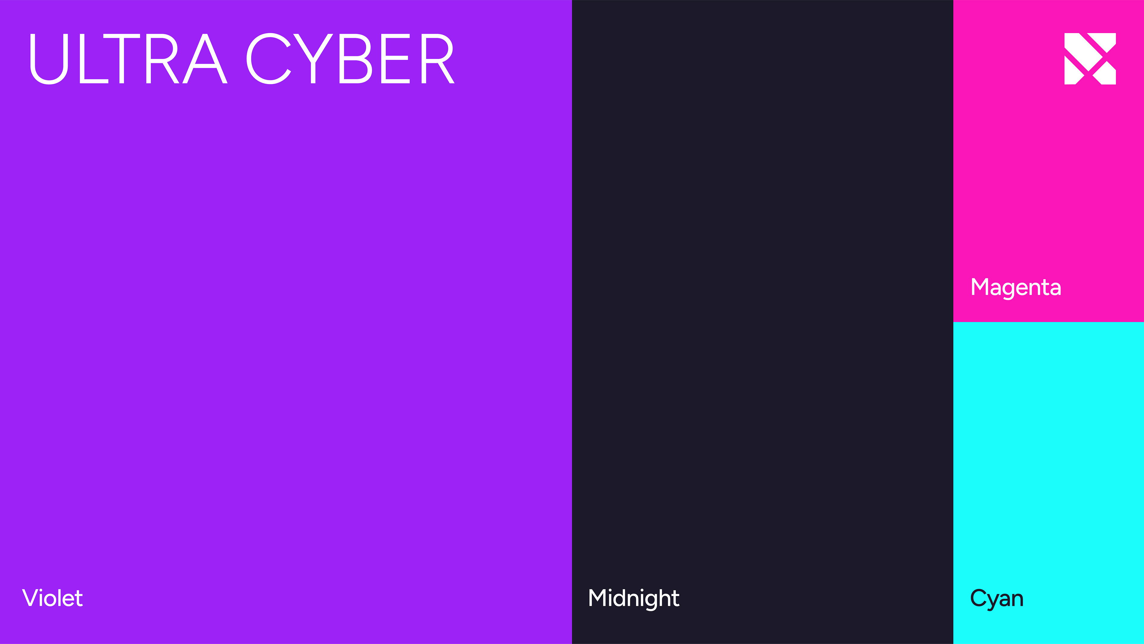
The final round was all about color. The palette we settled on is unique, vibrant, and energetic, nicknamed "Ultra Cyber". It evokes a sense of youthfulness, showing the personality and charisma that the young and talented team possess. These colors communicate that Rebus is a forward-thinking, data-driven brand. It’s also unique in the digital marketing agency space. When doing research for this rebrand, I discovered lots of brands using navy blue, black, red, and orange. But no magenta, cyan, and purple.
The team loved it!
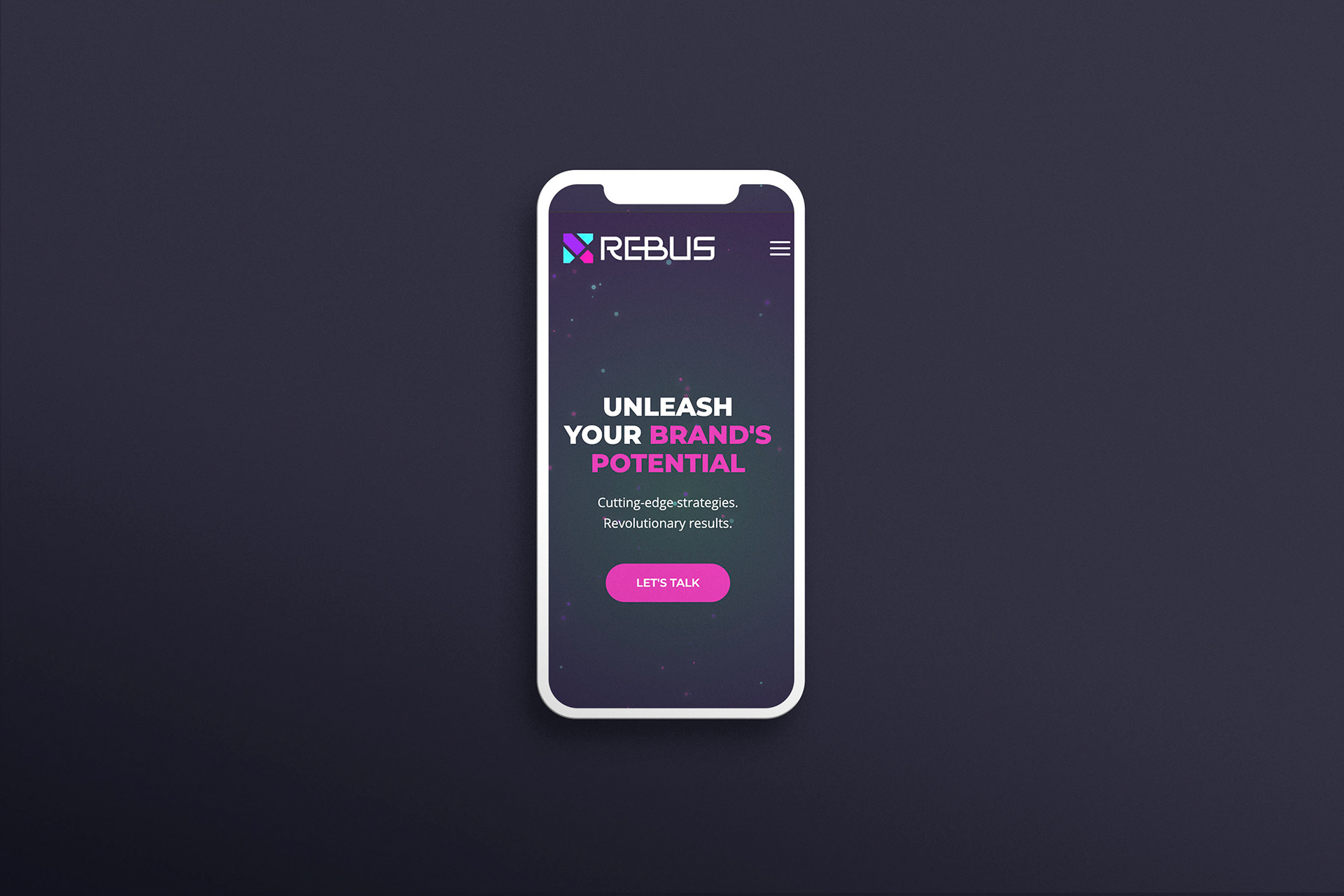
Final Results
Before and After
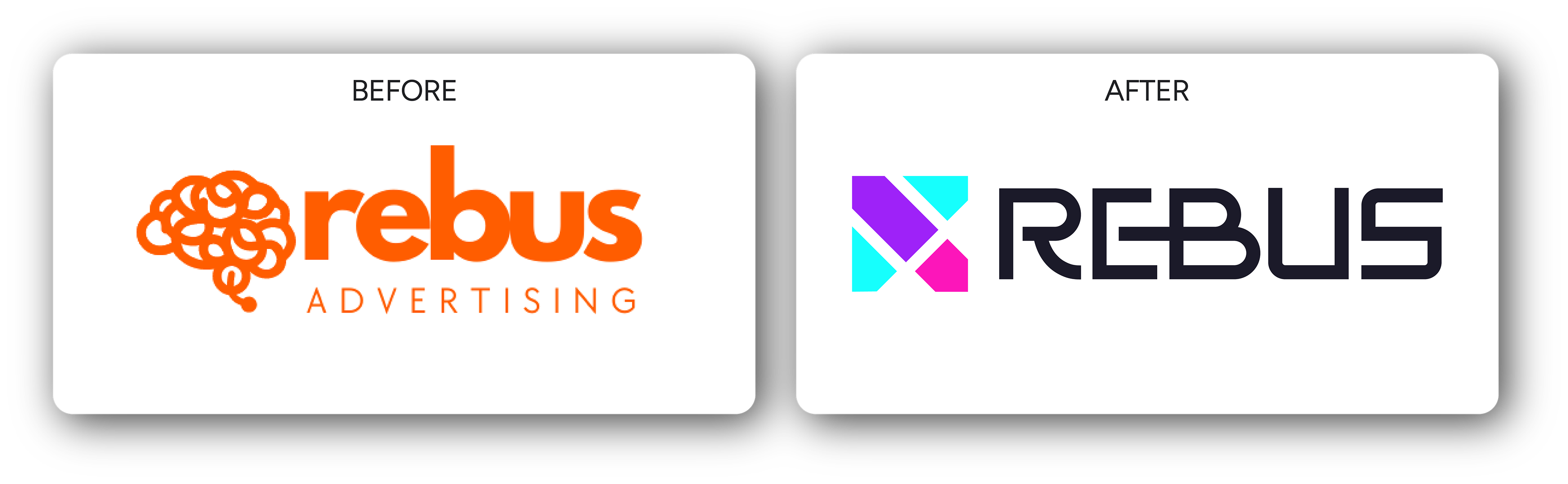
The before and after demonstrate the power of good design. The personalized, data-driven approach that Rebus takes is the same, as are the results they deliver. They now have a logo that communicates who they are, helping them more effectively reach their ideal clients–transforming more businesses along the way. I’m grateful to have been part of their brand’s transformation. To the moon!