About
RMVL is a junk and debris removal company serving residential, commercial, and contractor clients across Salt Lake County. They reached out to have me design a logo that would help maintain the clean, professional look of their company.
Challenges
1. Capturing the personality and values of RMVL Co in visual form.
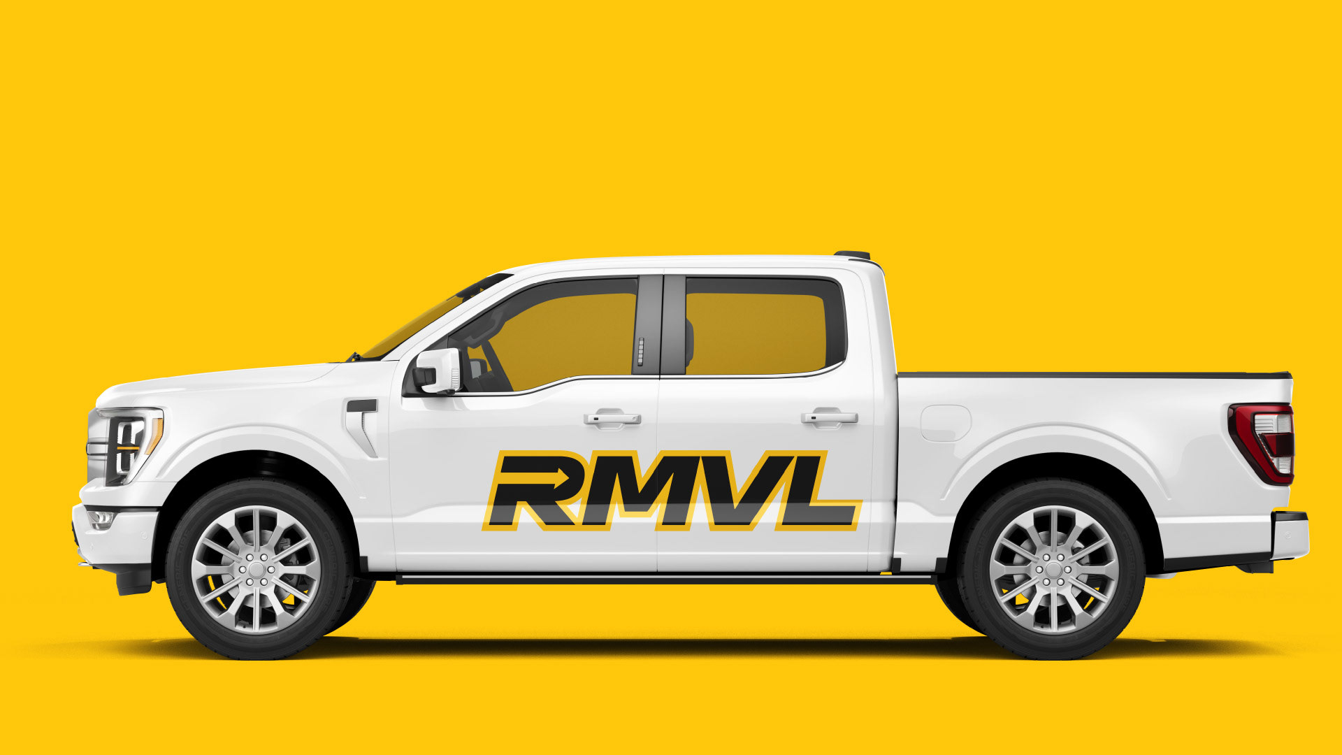
2. Balancing simplicity and meaning. This is vital as the logo would need to work on business cards and pickup trucks.
3. Creating a mark that fits the industry while being original and unique.
Process
Info Gathering
To better understand RMVL Co.’s business, including their customers and unique differentiators, I gathered information via a discovery questionnaire. The insights gained from this were valuable as I began the design process. For example, I knew that the clients preferred a wordmark and would need a logo to work when printed on the side of a pickup truck.
Visual References
With a deeper understanding of RMVL Co.’s business, I collaborated with them to create a visual reference board. This provided me with a clearer picture of what RMVL Co.’s owners were looking for from a visual perspective. It also served as a source of inspiration as I began sketching ideas.
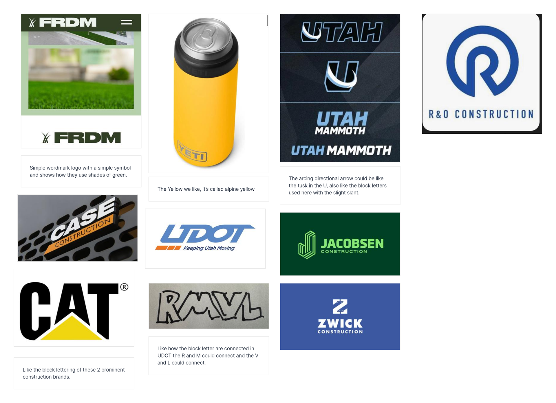
The visual references board that the RMVL team compiled guided the design process.
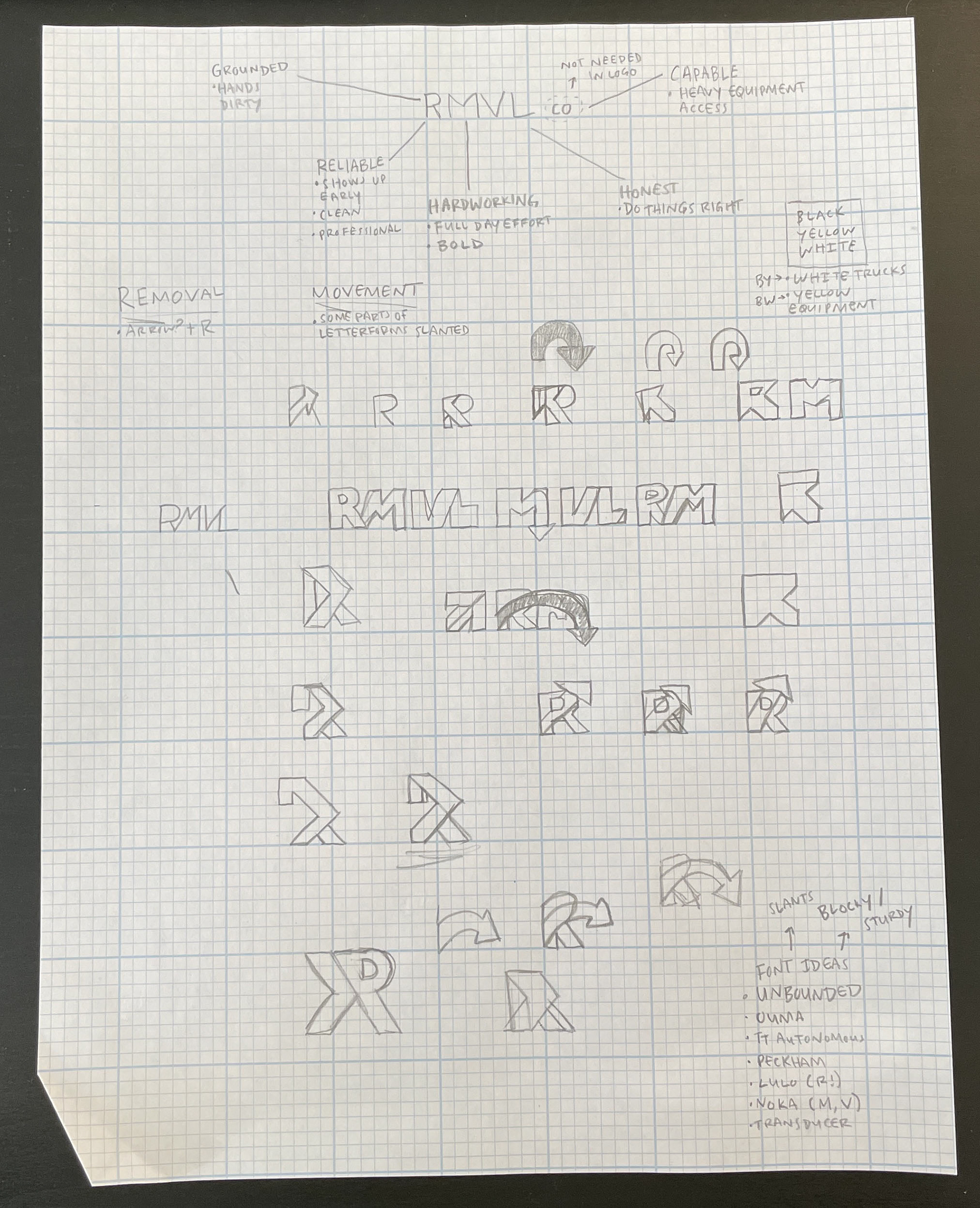
Sketches
From the outset of this project, I knew that the logo would be a wordmark. RMVL Co. wanted a mark that was highly legible, bold & minimal. These factors guided the ideas that I took to my sketchbook.
An important part of my sketching process is writing down all the words that come to mind as I consider the brand’s values, strengths, and key differentiators. In the case of RMVL Co, some of these words were “grounded”, “reliable”, “capable”, and “hardworking”.
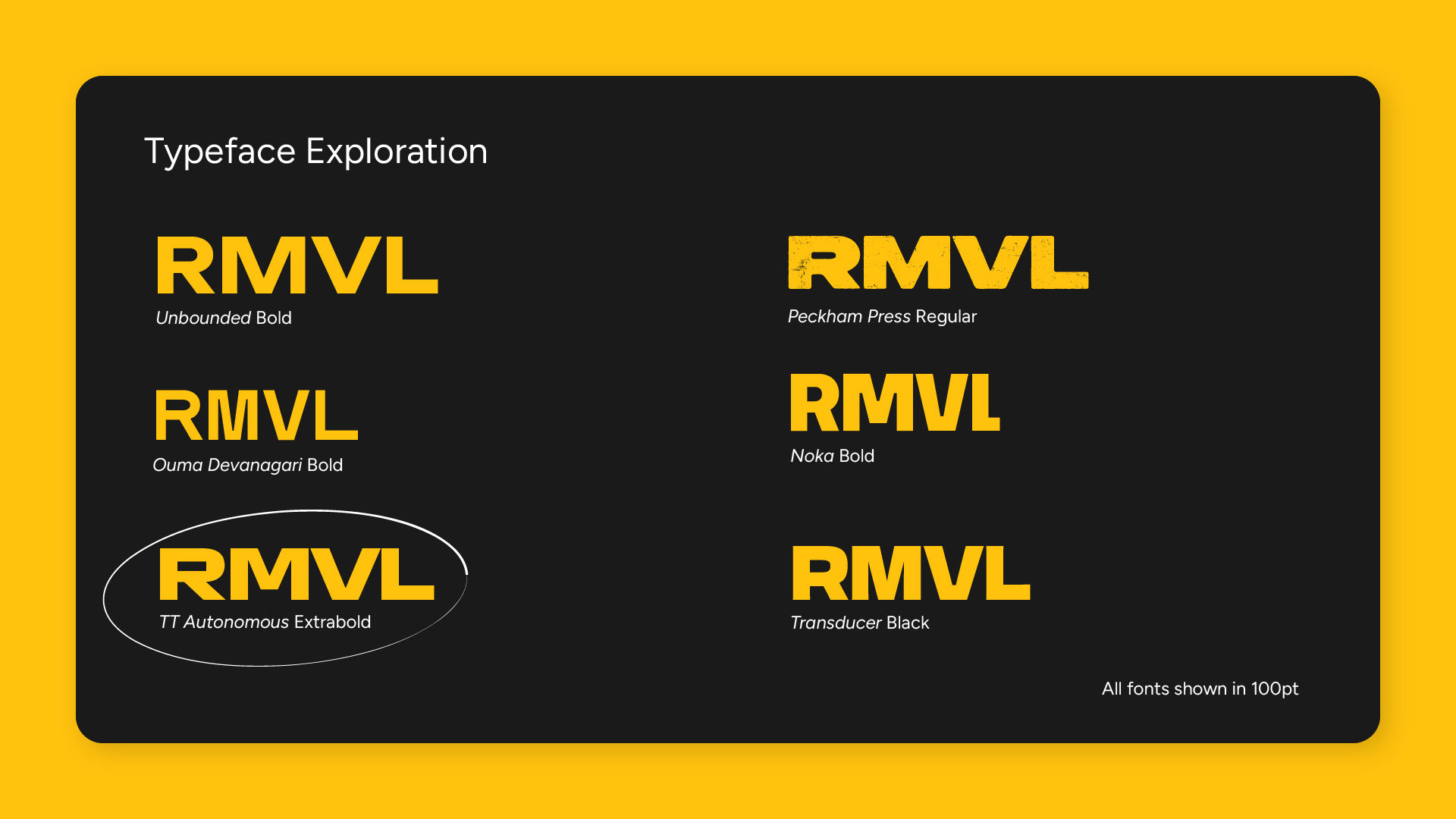
Digital Design
I began by exploring a number of bold, geometric sans serif fonts. These types of fonts fit both the values and desired visual aesthetic that the brand was aiming for.
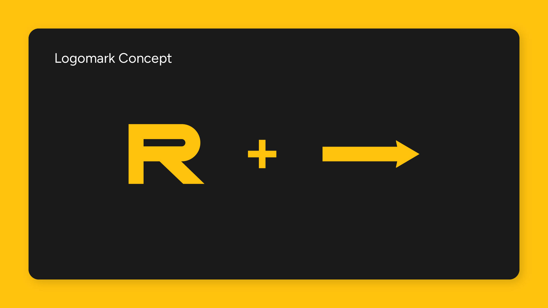
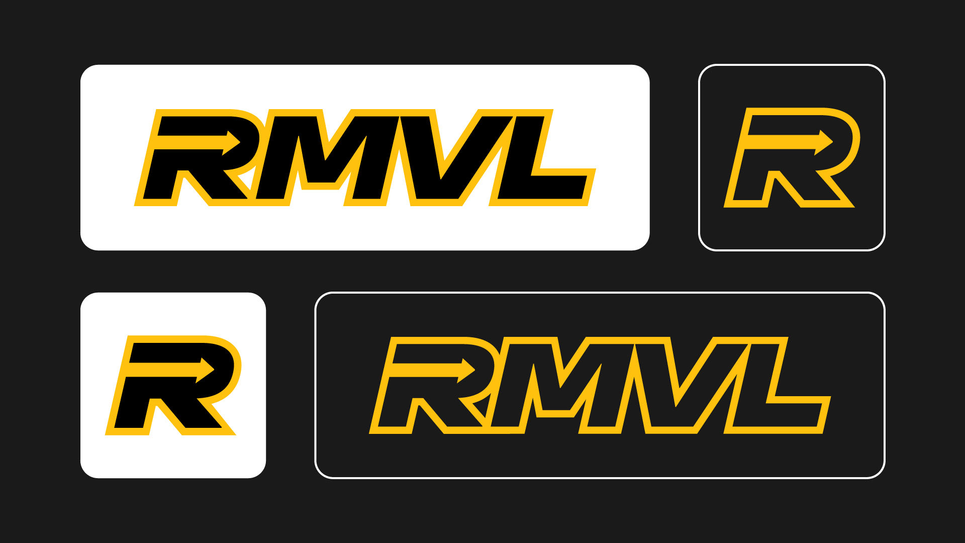
Once I landed on a typeface, I explored the idea of placing a forward facing arrow inside the negative space of the “R”. This created a sense of movement, while leaning into construction-industry imagery. I was happy with this approach as it was simple and bold and communicated the key values and unique proposition of the brand.
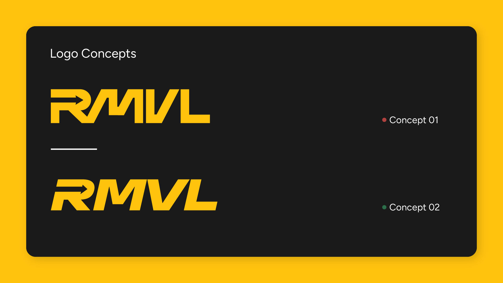
Initially, I created two different variations on this design. One was constructed from custom type forms and featured straight lines and geometric shapes. The second option utilized an existing typeface, , in its italicized form. I chose this typeface because it matched what RMVL Co was looking for: a logo that was reliable, capable, and hardworking. The italicized styling added movement, playing into the concept of moving junk from one place to another.
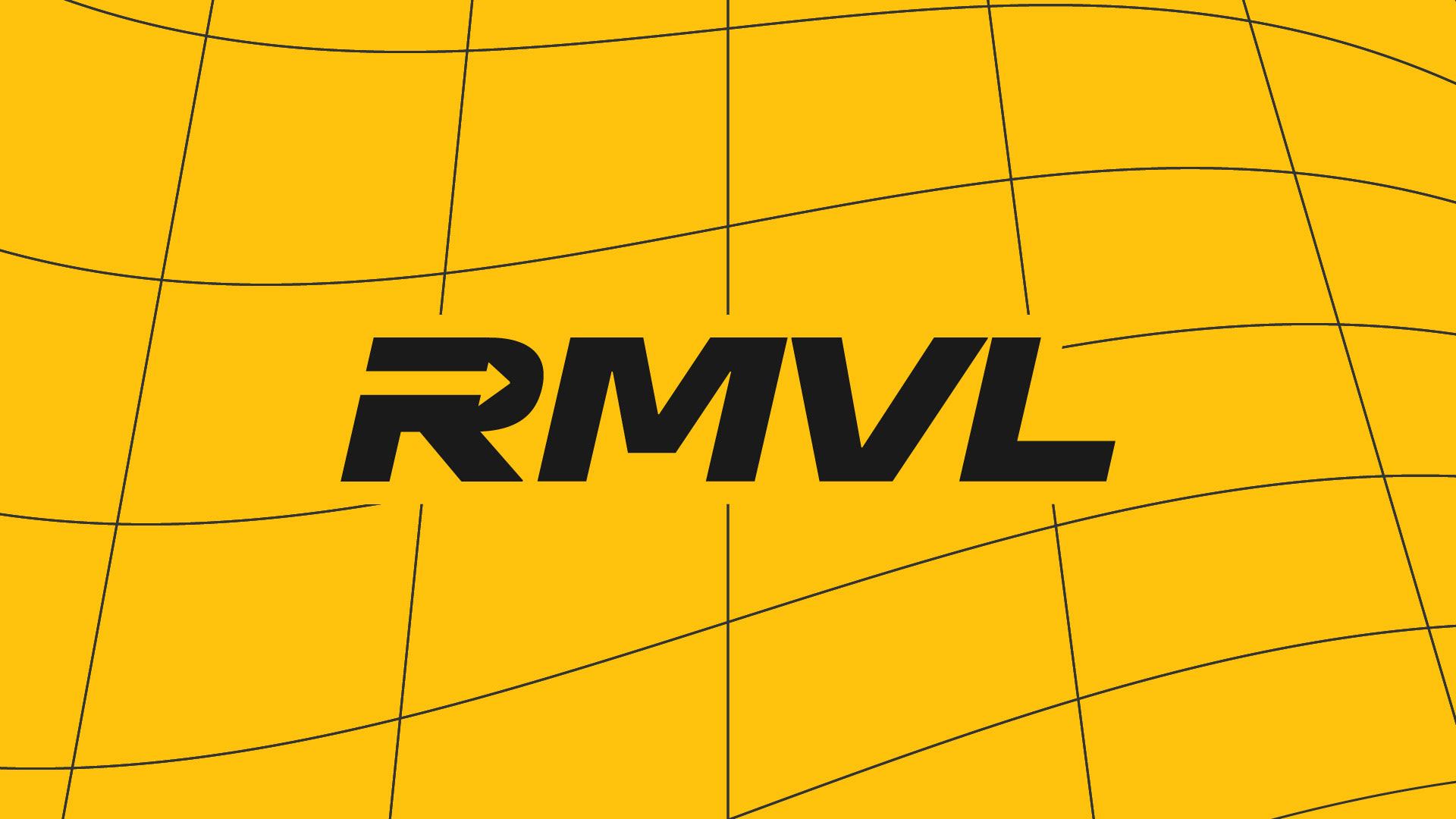
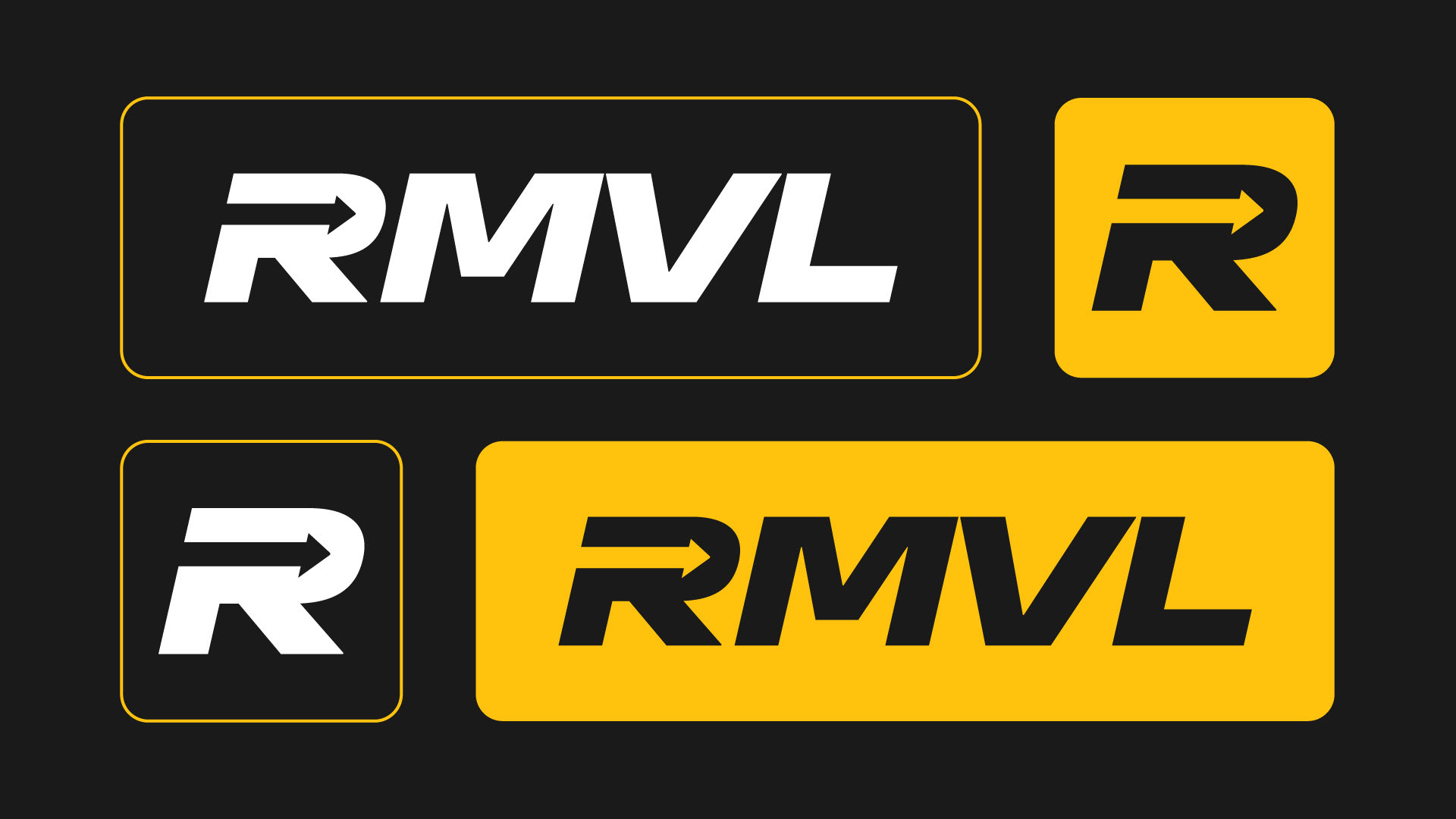
Results
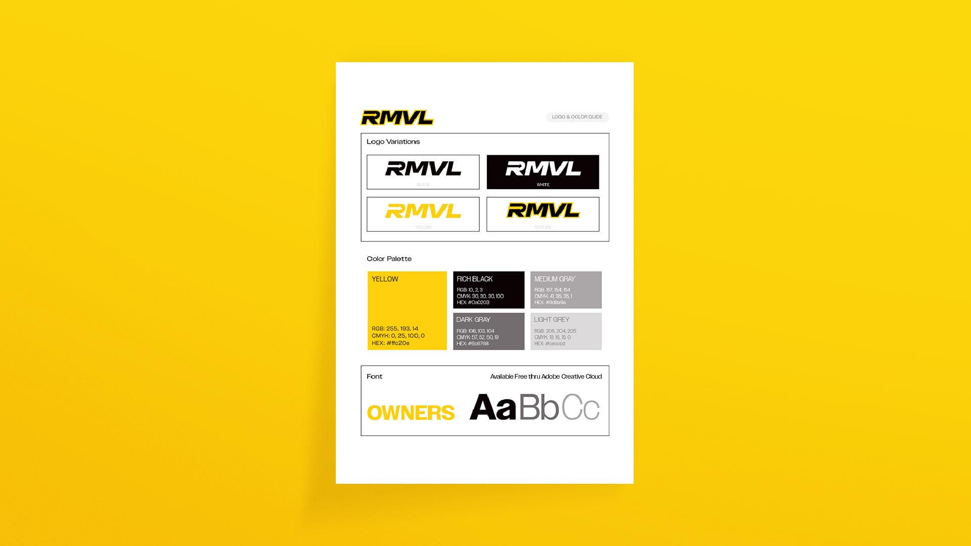
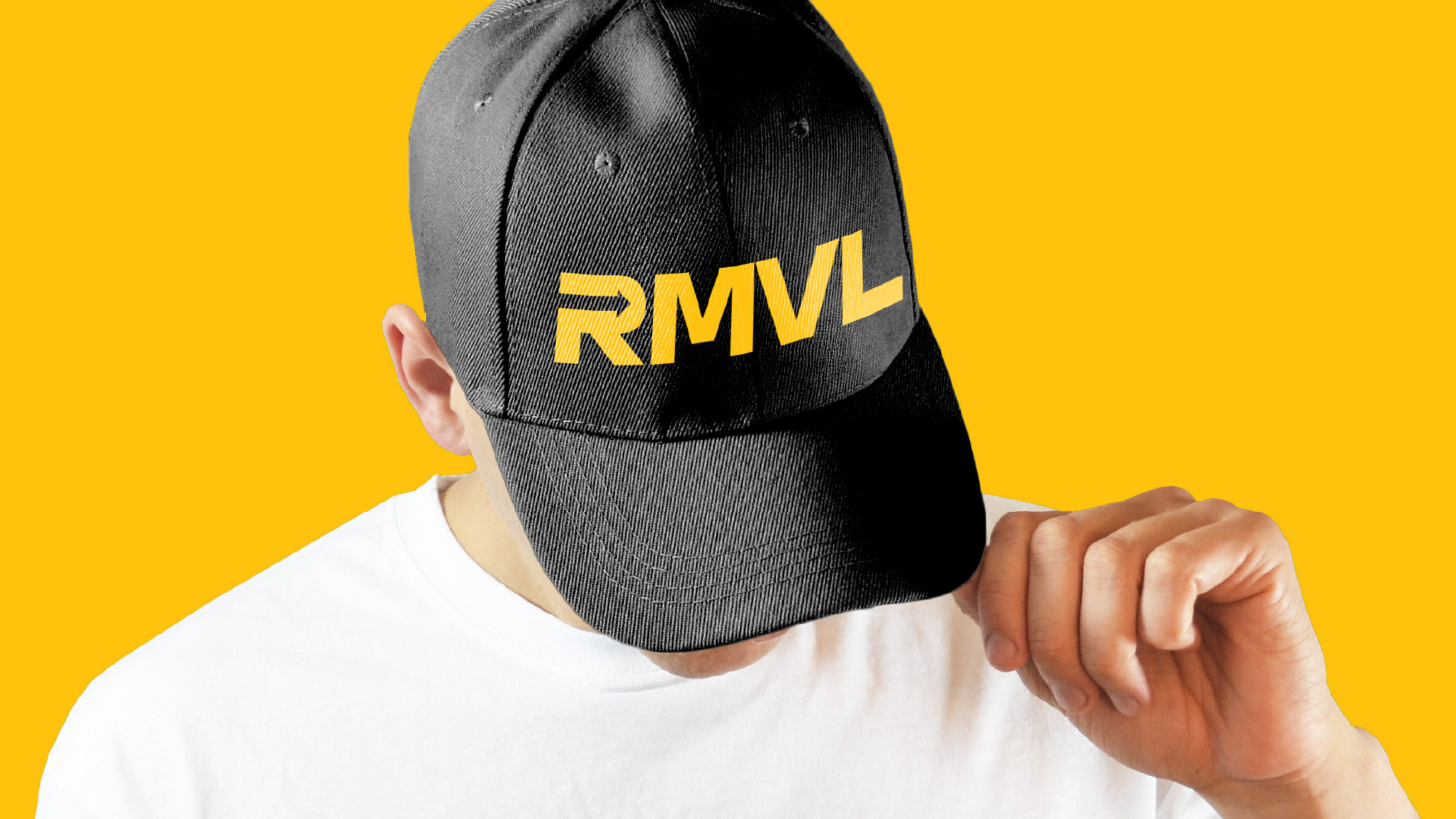
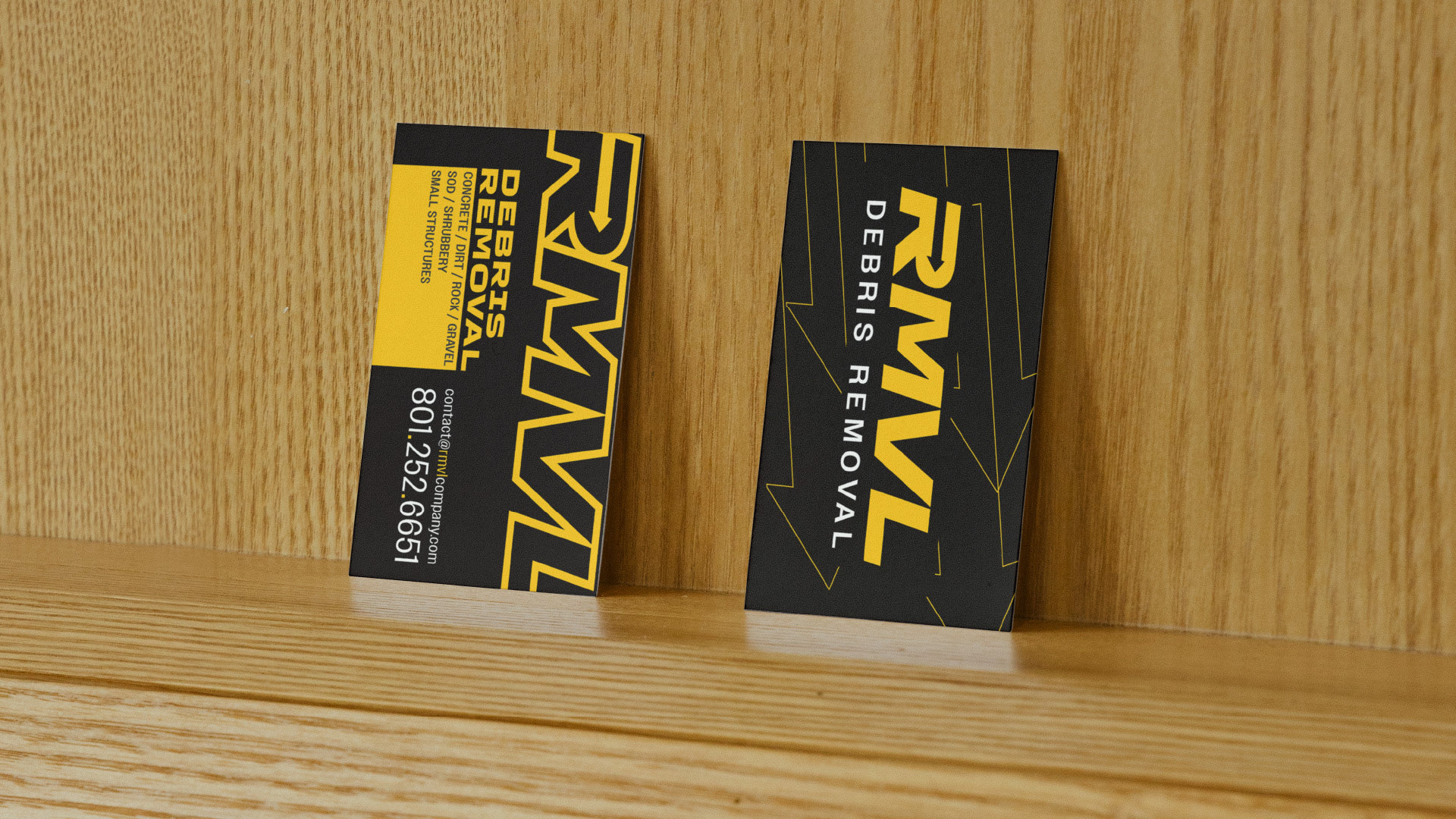
The end result is a logo that fits the RMVL Co brand and communicates their reliable, capable approach to junk removal. Printed on their trucks, this mark will immediately communicate to clients that they are trustworthy, professional, and honest. The business card designs lean into the arrow symbolism, showcasing that RMVL Co is passionate about their work: getting junk out of homes and construction sites.
Testimonial
“Ryan, all of this is awesome, we really appreciate all the work you have put in. We didn’t expect this high quality of a logo. You’ve been great to work with and made us a logo that exceeded our expectations.”