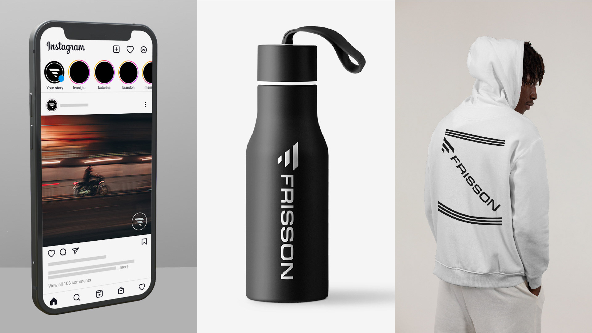
About
The word frisson describes a “sudden strong feeling of excitement or fear; a thrill”. FRISSON is a content creator, focused on producing this strong feeling through videos of adrenaline-inducing activities (think motorcycles, automotive racing, etc.) For this project, I was tasked with creating a logo and associated wordmark to represent FRISSON on social media and in real-world applications.
Challenge
How do you capture the feeling of speeding down the road on a motorcycle or flying through the air while skydiving, and turn that into a logo? This task seemed monumental. As I began ideating, it became clear that I might fail by missing the mark entirely. The goal was to design a logo that conveyed a sense of momentum while also being modern and minimal.
Process
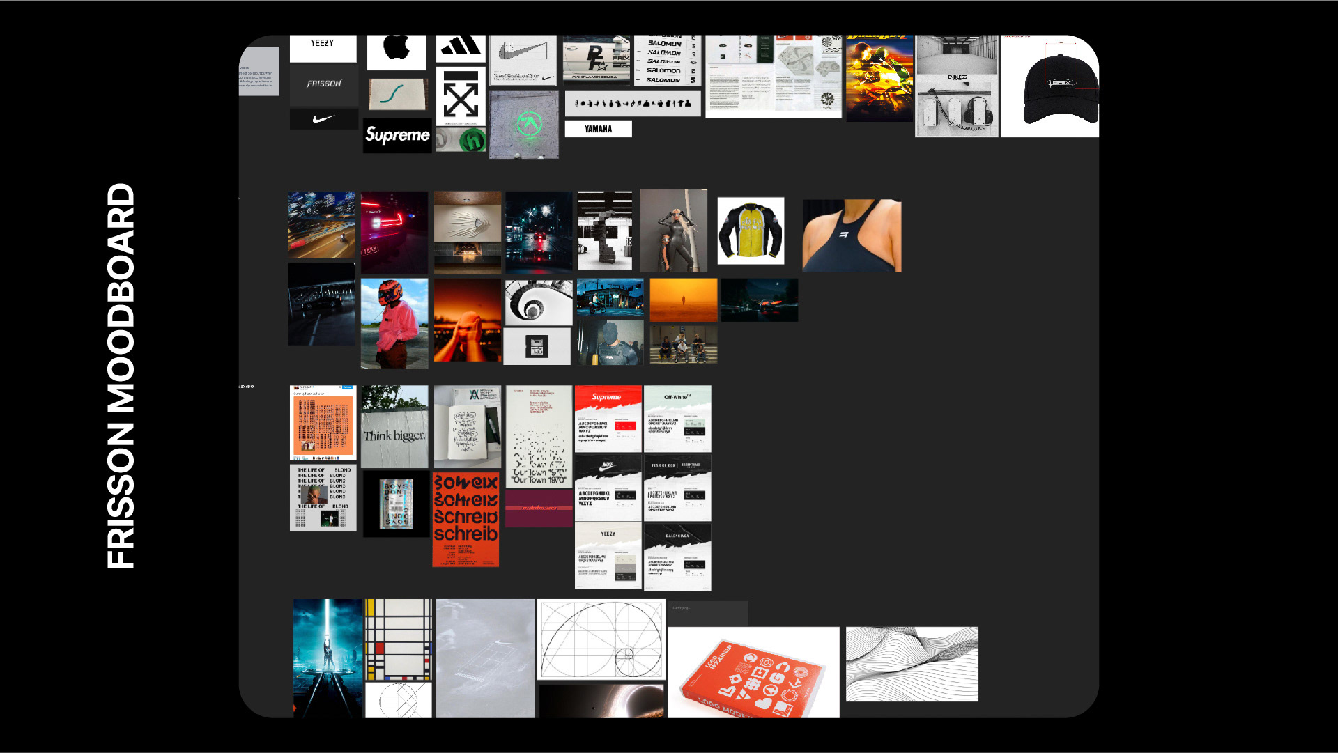
Visual References
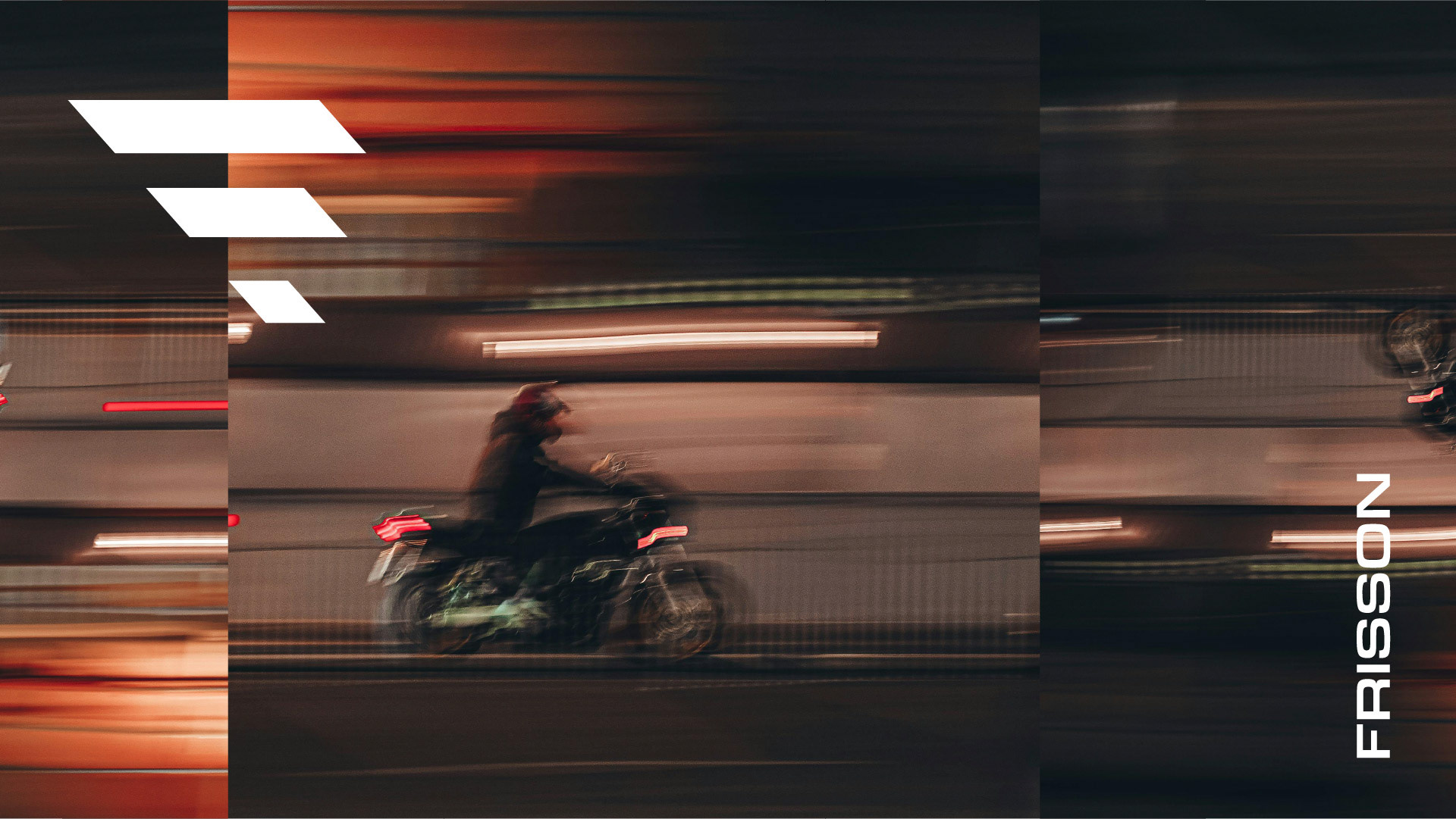
We started by collaborating on a Milanote board, like I do with all my client projects. For FRISSON, we walked the road of modern design. Think anything Massimo Vignelli or Michael Beirut; typefaces like Helvetica and Futura; brands like Apple, Nike, and Yeezy; modern fashion brands like OFFWHITE and Supreme. FRISSON lives on late-night city streets, so naturally, motion blur, neon, and slow-motion movement were part of the desired aesthetic.
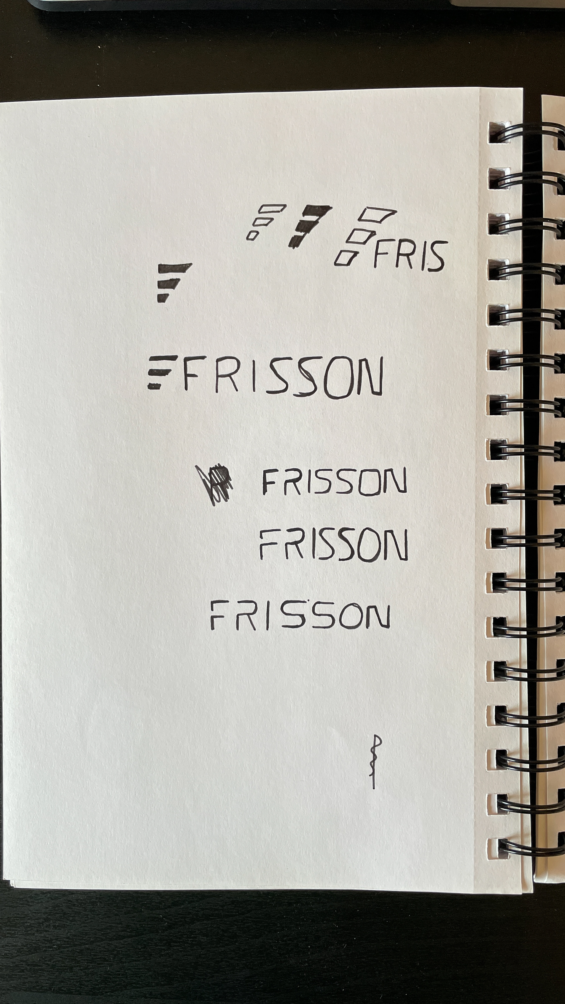
Sketches
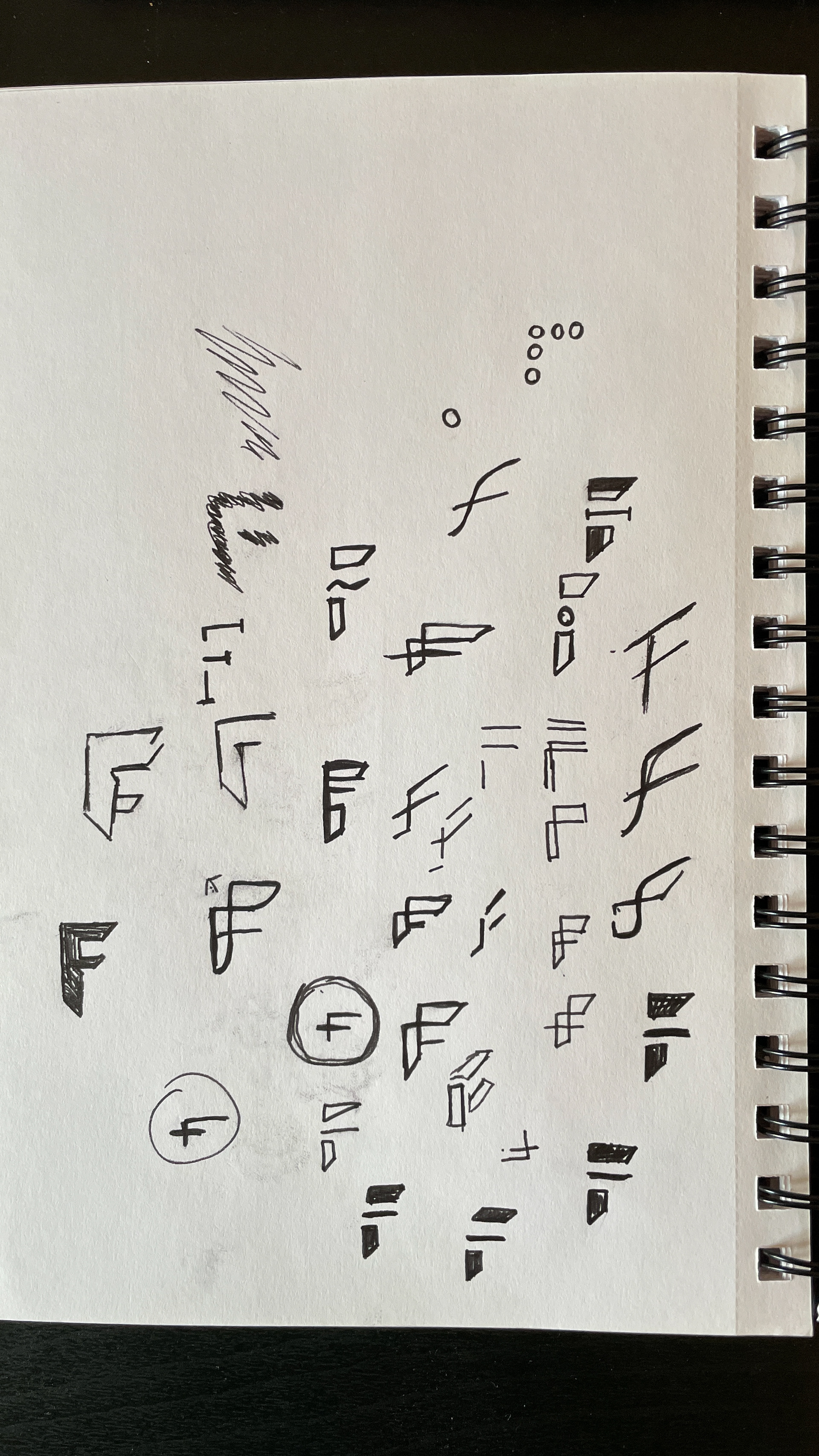
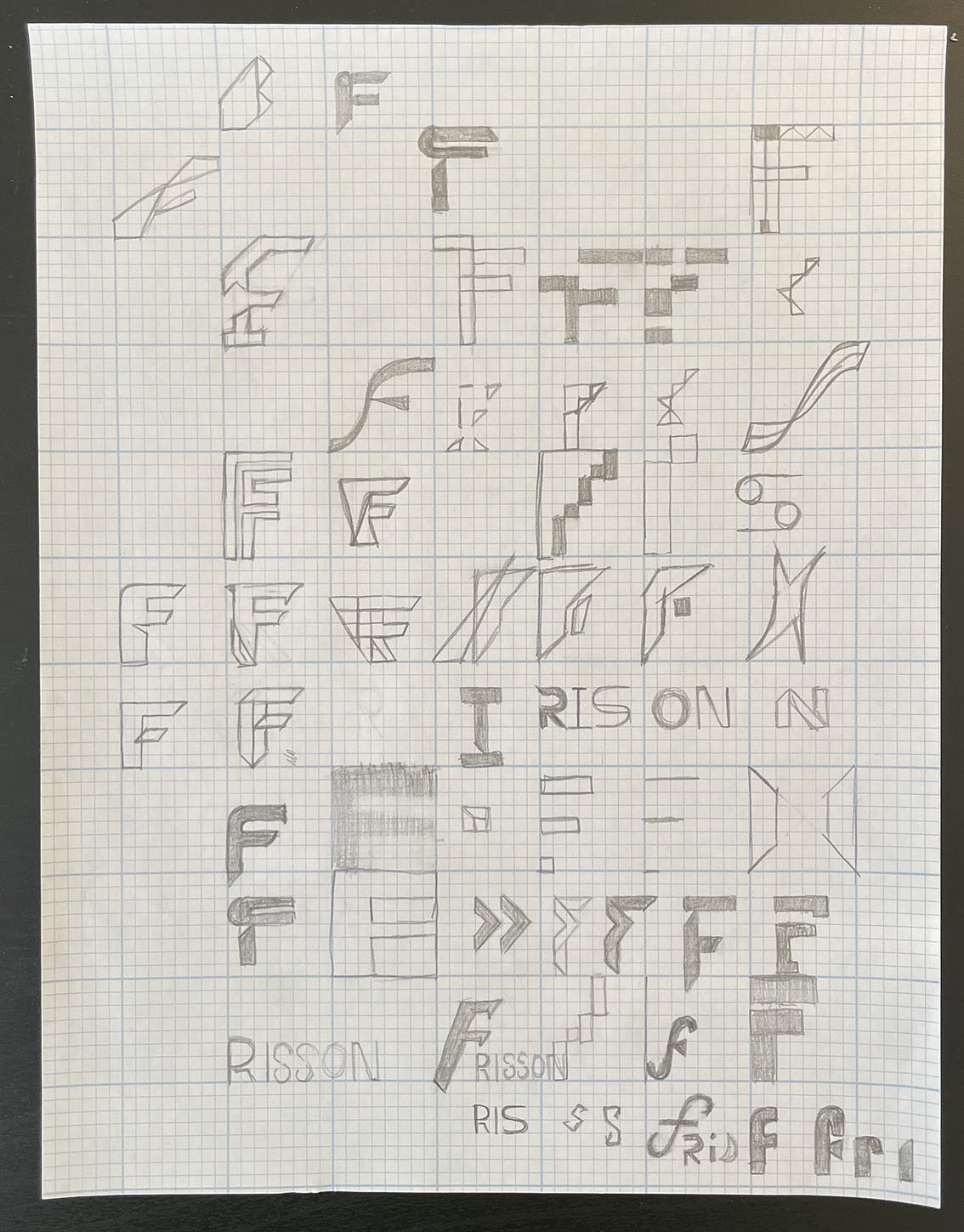
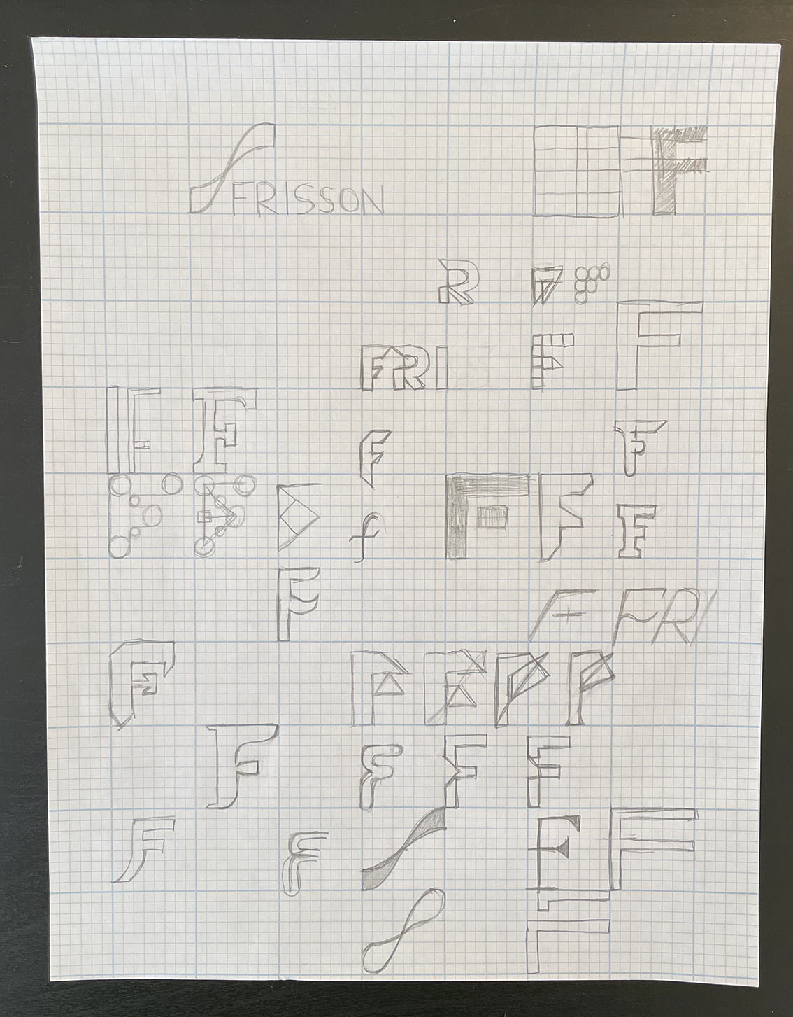
My initial ideas were very abstract. I played with waves, triangles (think “delta”, or change), curves. After showing some of these ideas to the client, he wasn’t as keen and suggested sharp lines and angles to represent movement and motion. I felt that the natural shape of the letter “F” would lend well to this and started going in that direction. These ideas were well received, so I started playing with potential type treatments as well.
Digital Design
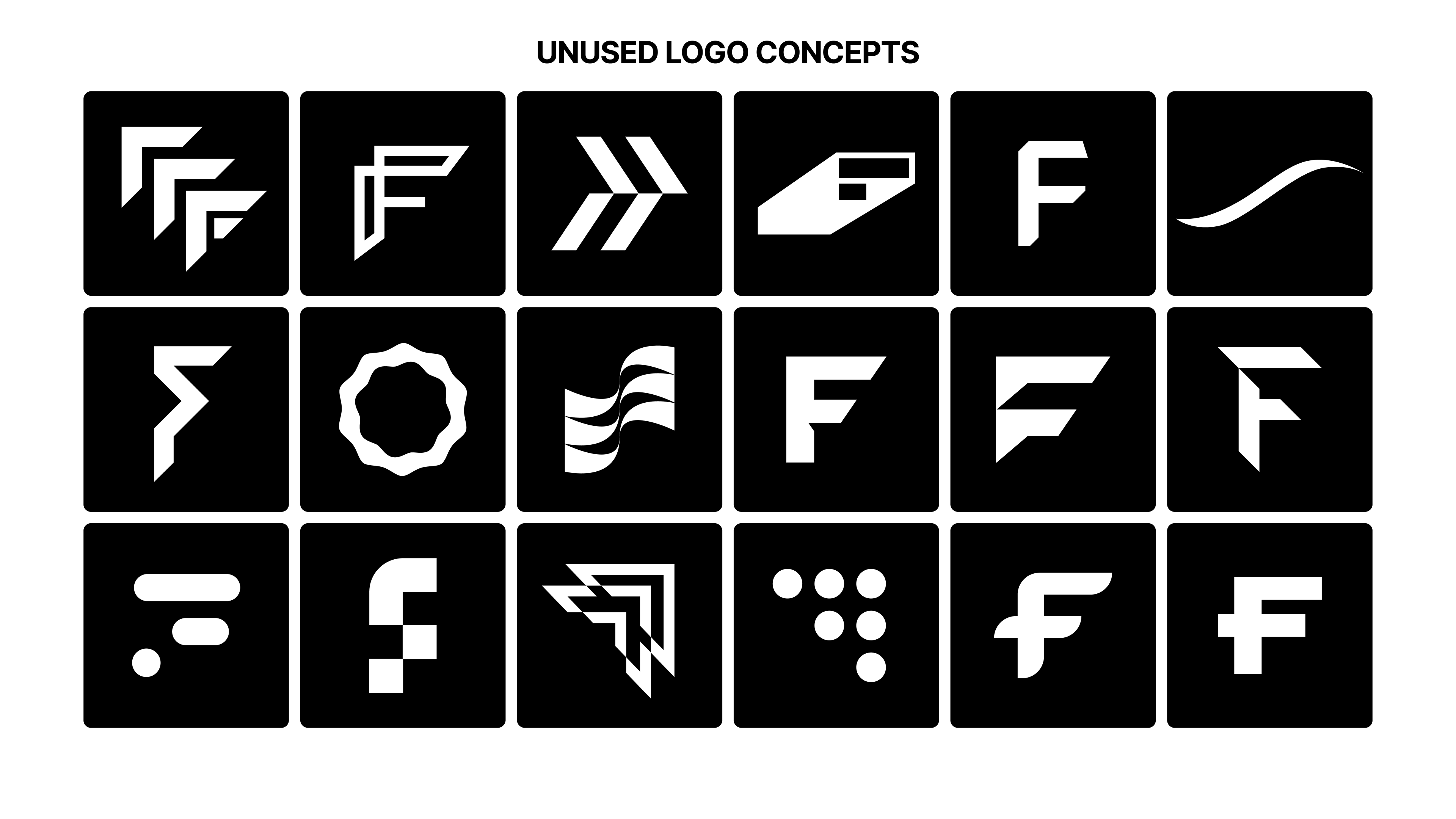
I created upwards of 20 different variations of the logomark throughout the digital design process, which comprised five rounds of design. Each round included sketching logo concepts, creating digital versions in Illustrator, having in-depth discussions about the concepts, and talking about the strengths, weaknesses, and thought processes behind each design.
This highly collaborative process led to the creation of a brand identity that is minimal, memorable, and timeless – just what the creator of FRISSON was looking for.
Results
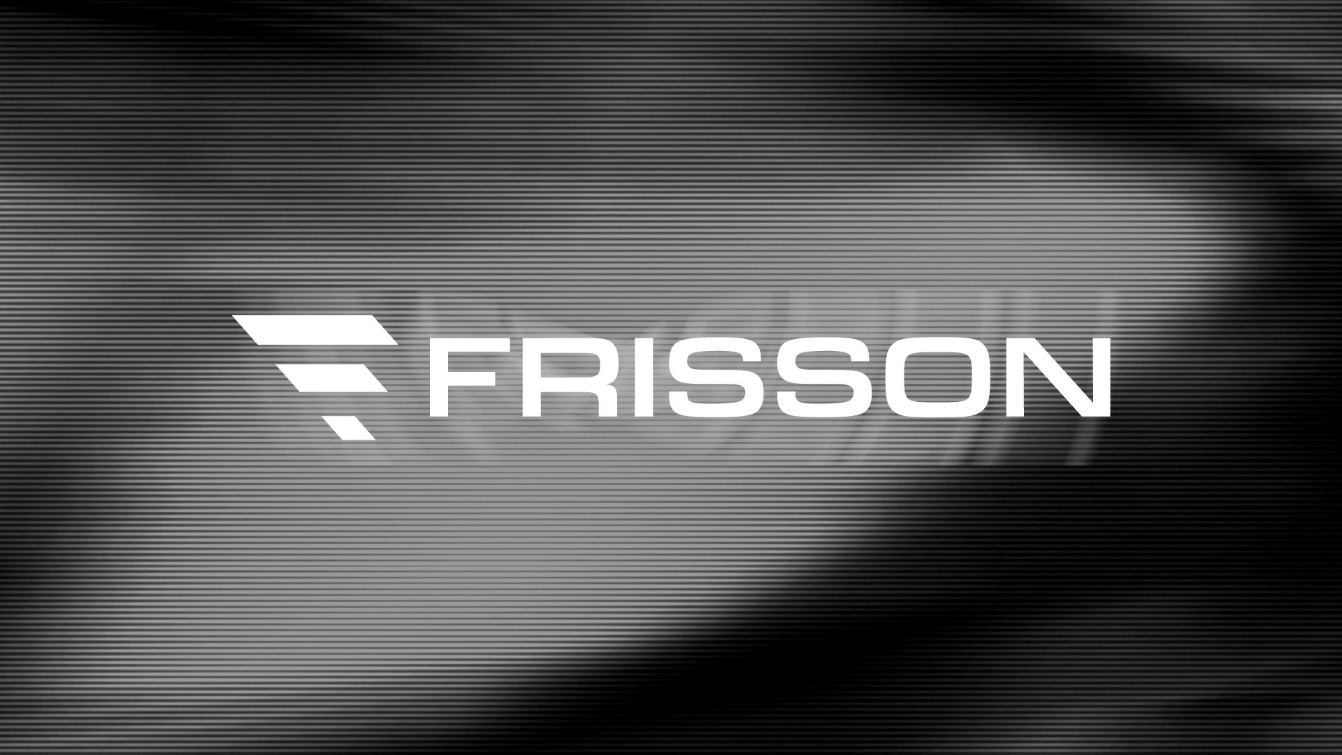
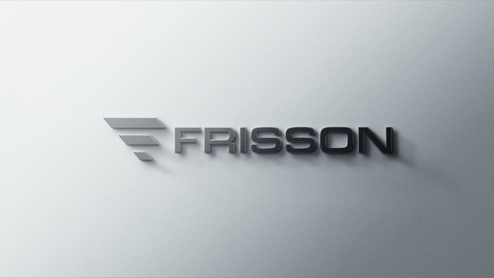
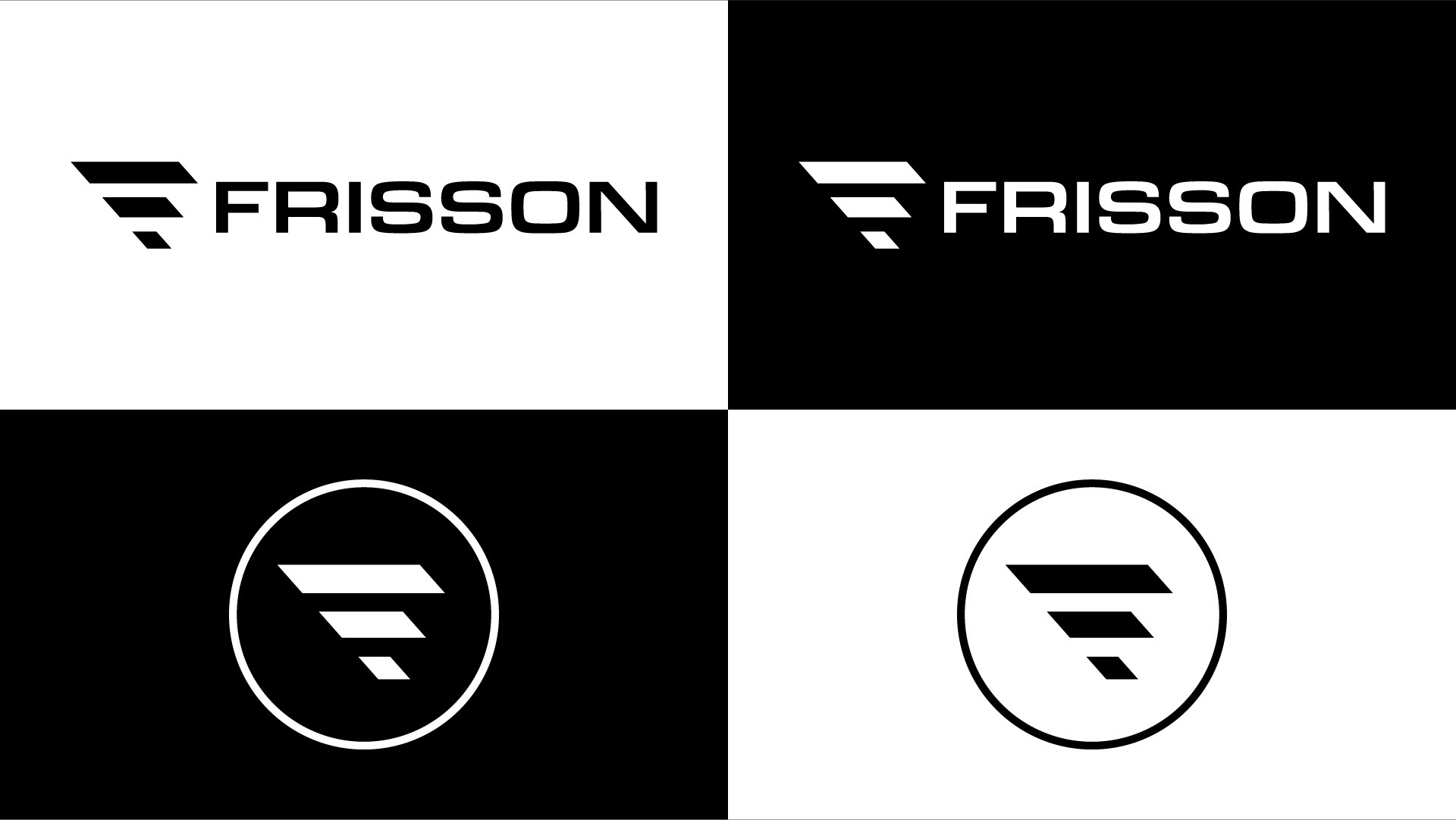
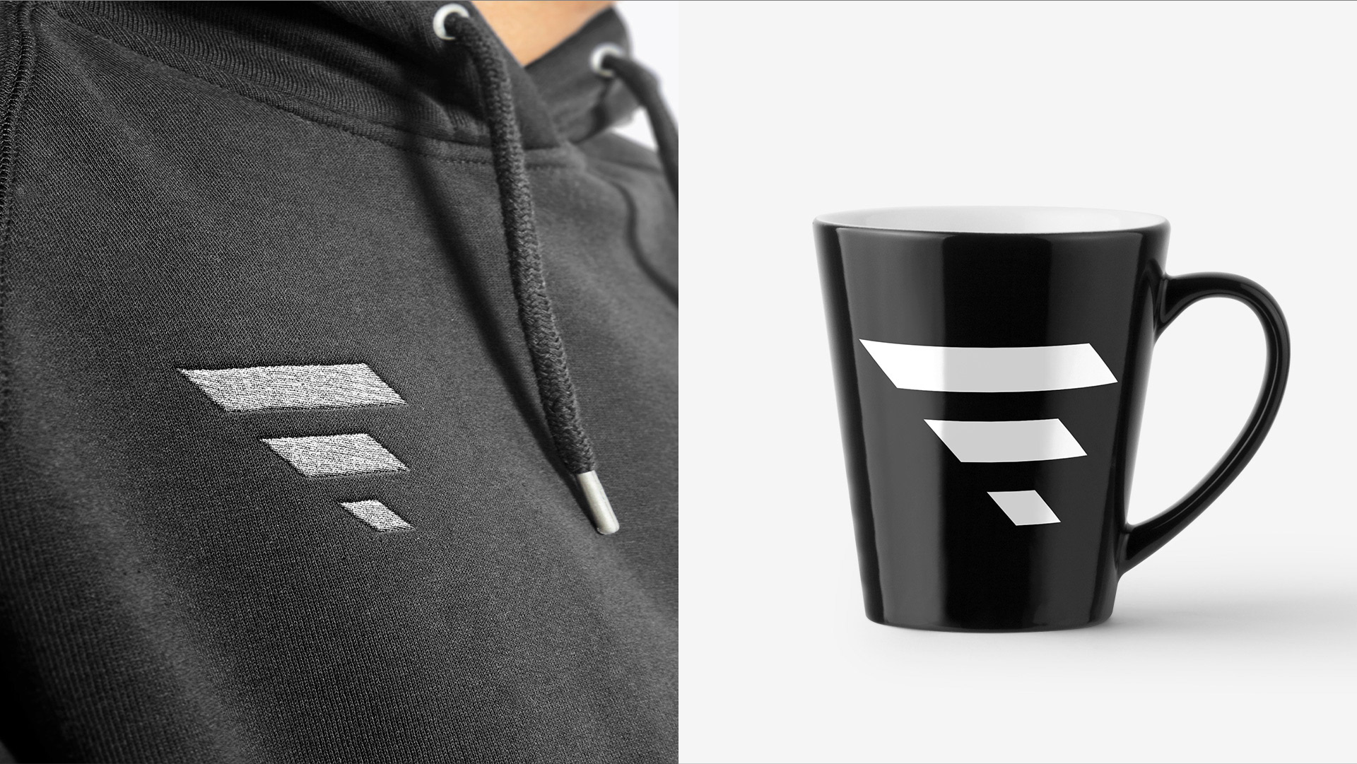
The final logomark achieved the goal of being modern, minimal, and dynamic. The progression of shapes from small to large, combined with the angles and edges, provides a sense of speed and momentum. The overall wing or arrow shape also contributes to this idea. Using 3 shapes to create the logo brings a feeling of stability and harmony.
To complement the logomark, I chose Eurostile Extended in a medium font weight. This typeface is timeless, often used in tech and automotive settings. Some favorite uses include the 1997 Honda Civic dashboard and vintage electronics.
Testimonial
His testimonial was short, sweet and to the point:
“Was a great experience bro, thanks for everything!!!”