About
Orbis Consulting was founded in 2021. They serve clients in the financial sector, specifically private equity firms, by providing customized financial models. By utilizing highly-trained outsourced labor, they provide their clients with quality models that are delivered quickly and cost-effectively.
Challenges
My primary challenge in designing this logo was creating a mark that felt immediately trustworthy and professional, without feeling stiff, old-fashioned, or antiquated. Orbis is a modern company, working with many businesses that are building the future. I wanted the logo to fit their identity while also being appealing to their clientele.
Additionally, Orbis Consulting needed a unique brand identity that set them apart from competitors. This would also help them bring in more client work and become the number one option for previous clients.
Process
Research
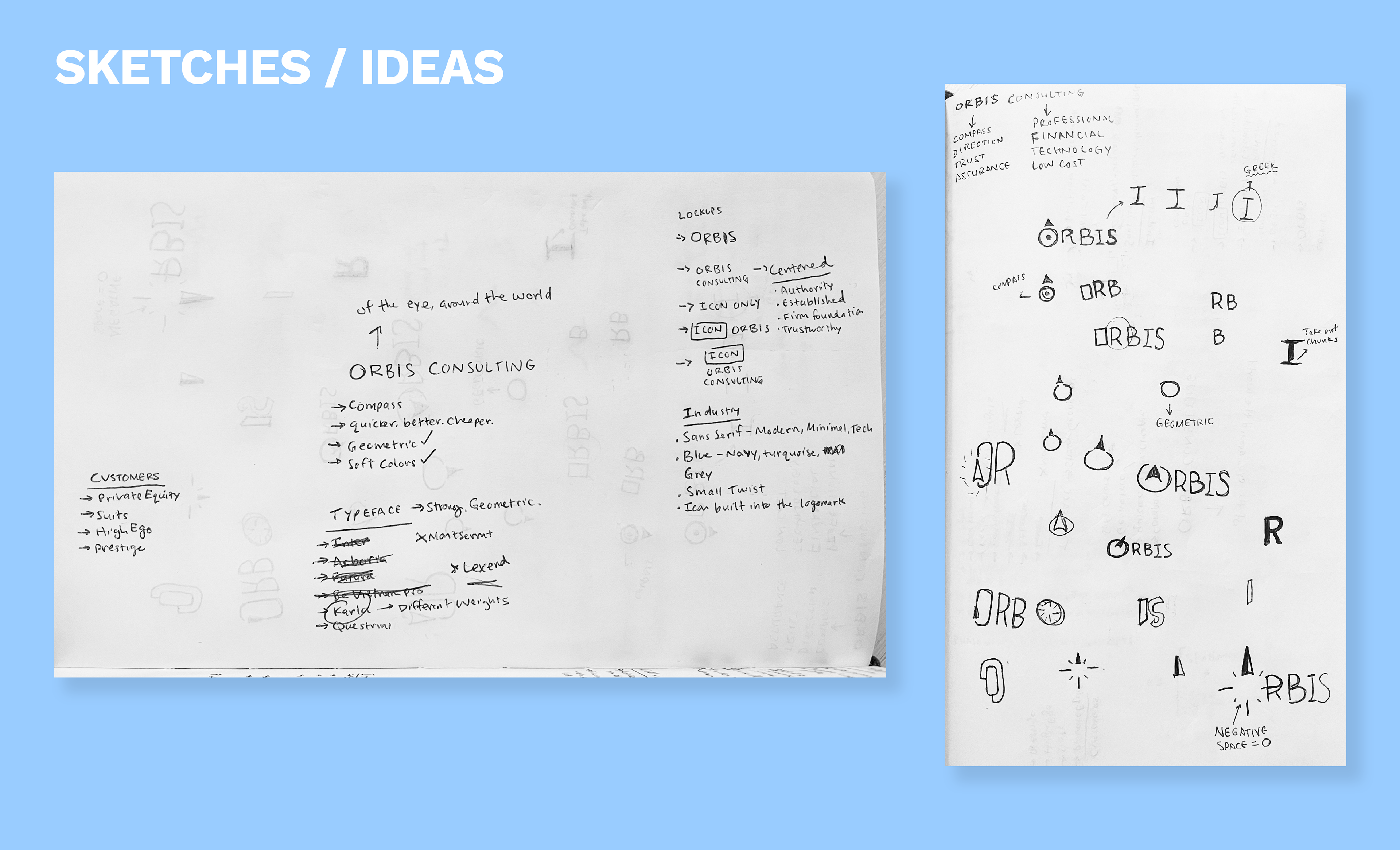
I began by striving to better understand the target customer. The clients Orbis works with are in the private equity space. This meant that the Orbis brand needed to feel trustworthy, professional, and established from day one. In my conversations with the founder, Neil, I learned that the word Orbis roughly translates to "compass" and "of the eye". He was interested to see this concept incorporated in the design.
Sketches
Based on the insights from Neil, I began by sketching concepts that incorporated a compass-style design. My goal was to keep the logo as a powerful, minimal wordmark, with an icon or symbol as part of that mark.
Digital Design
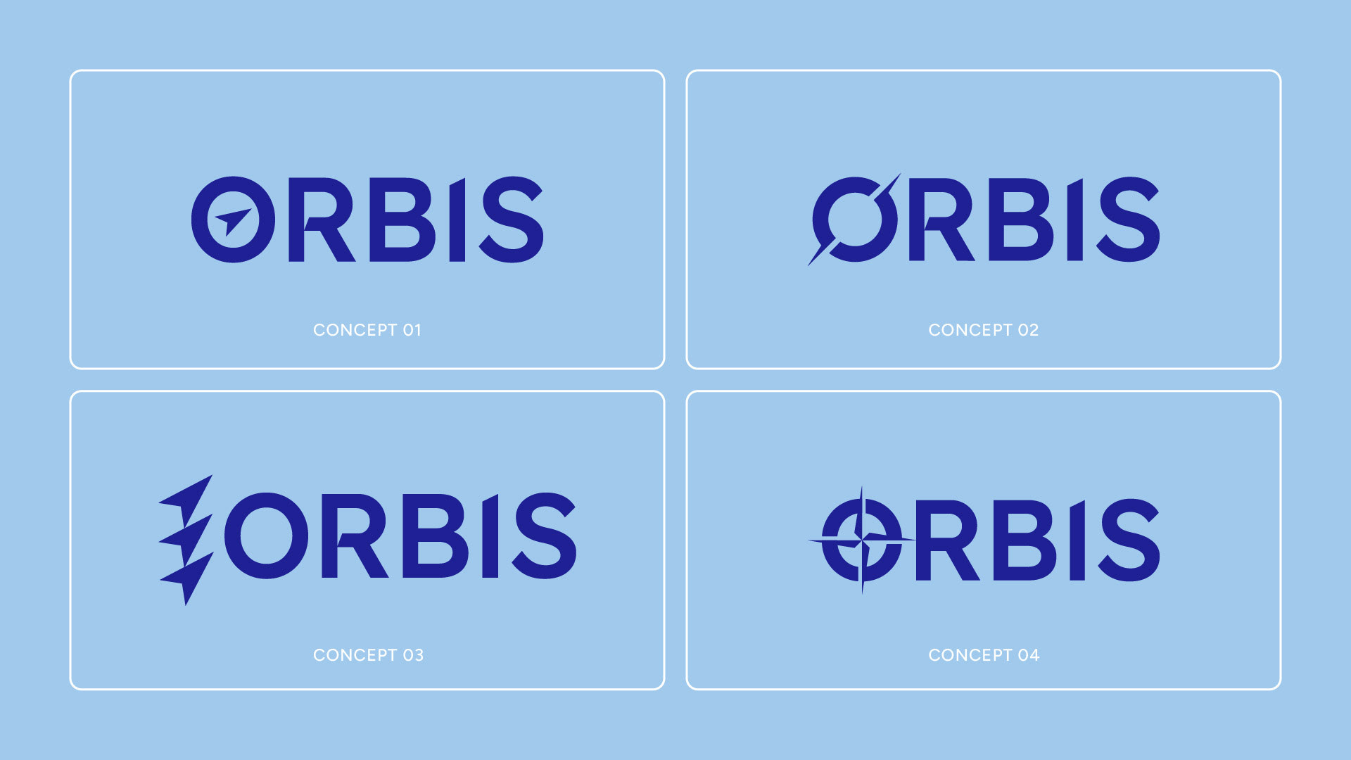
I continued pursuing the idea of a compass in my digital designs within Adobe Illustrator. As I traveled further down this rabbit hole, I realized there are many different ways to symbolize a compass or direction. I landed on 4 different design directions and presented each of these to Neil.
Results
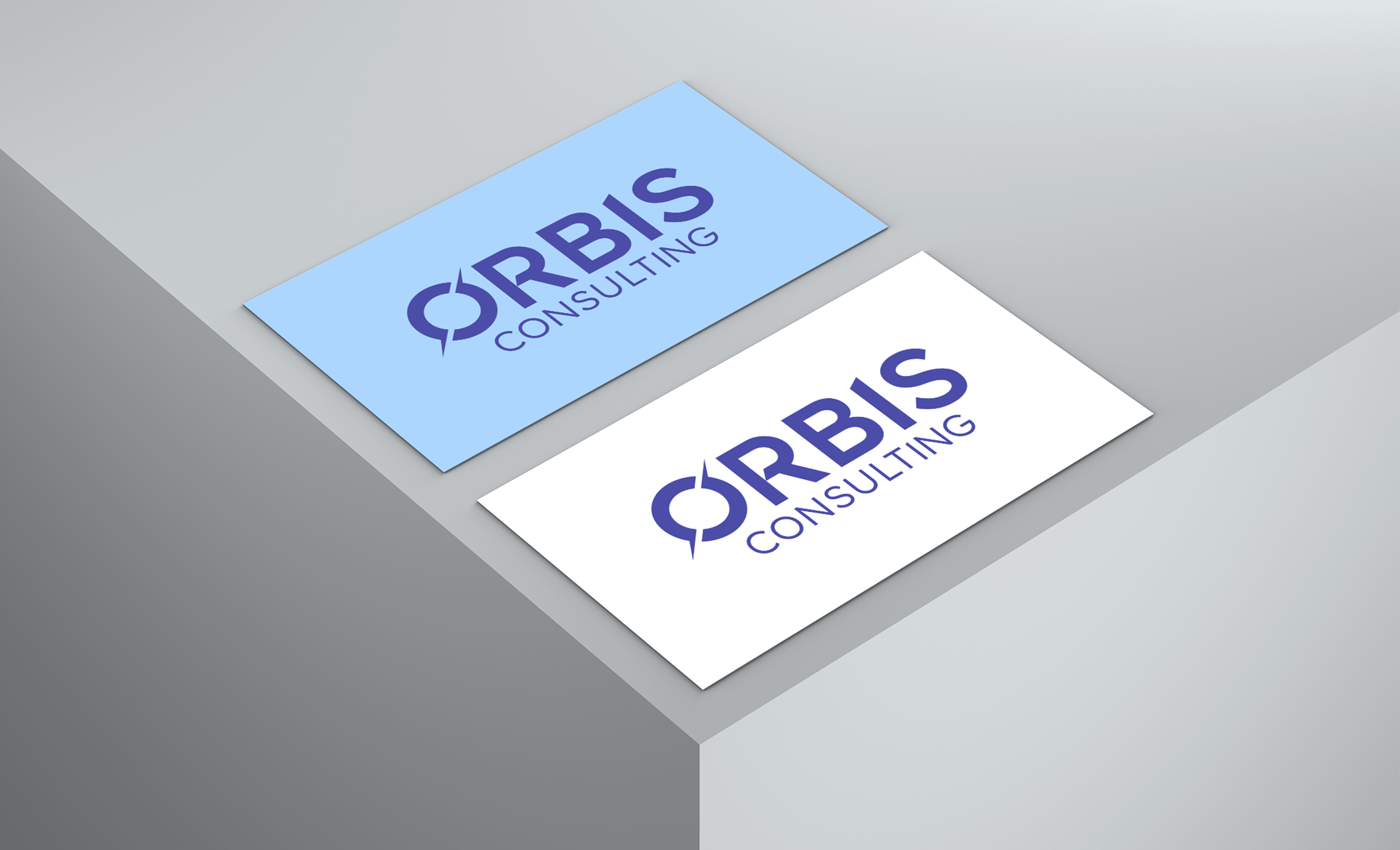
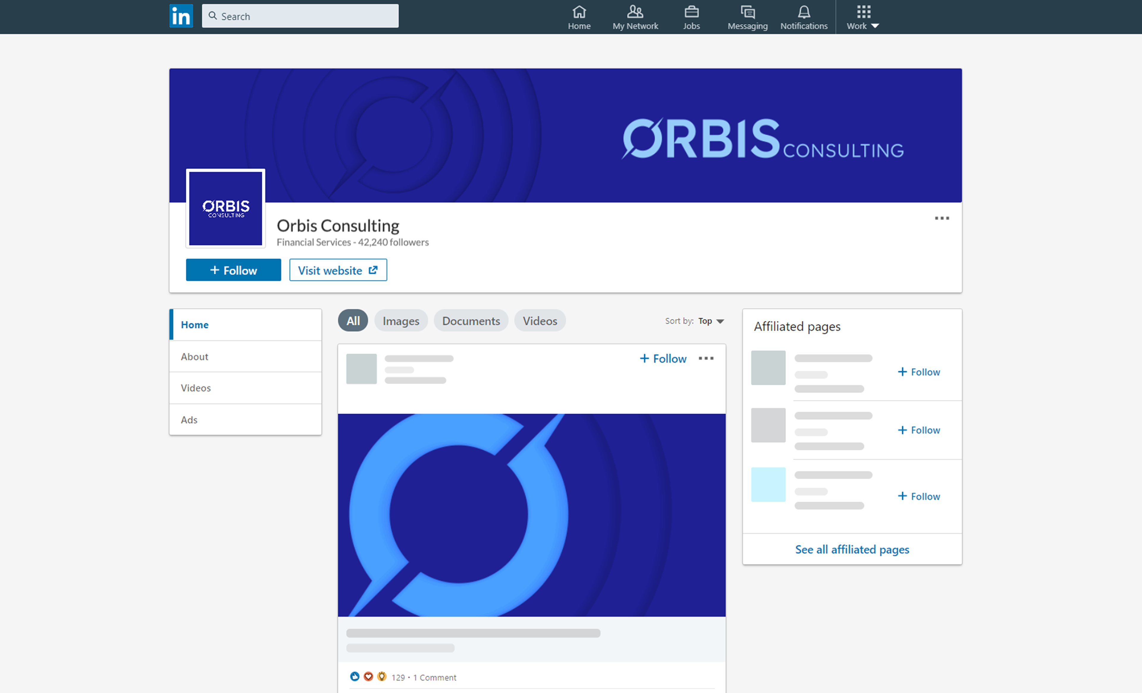
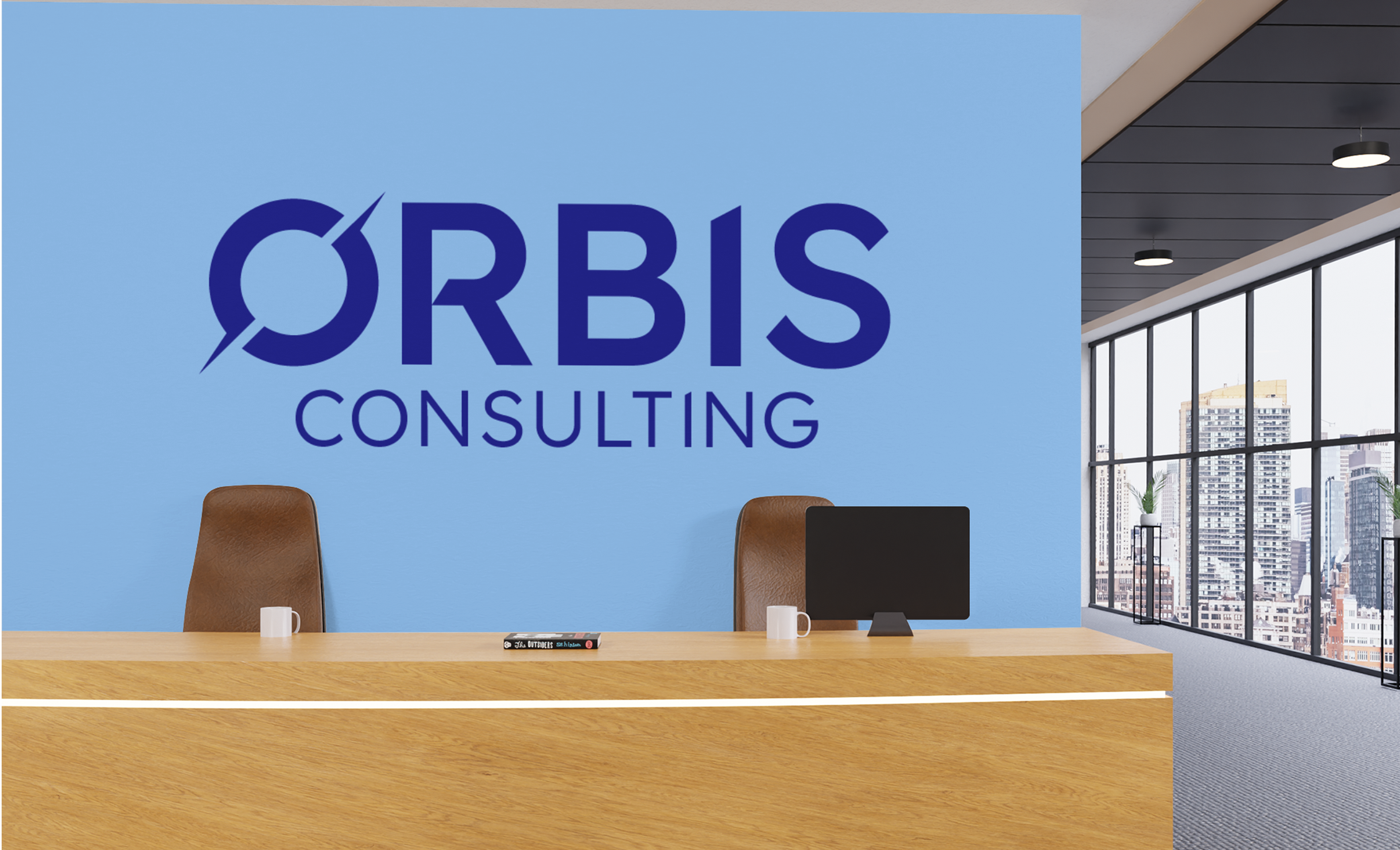
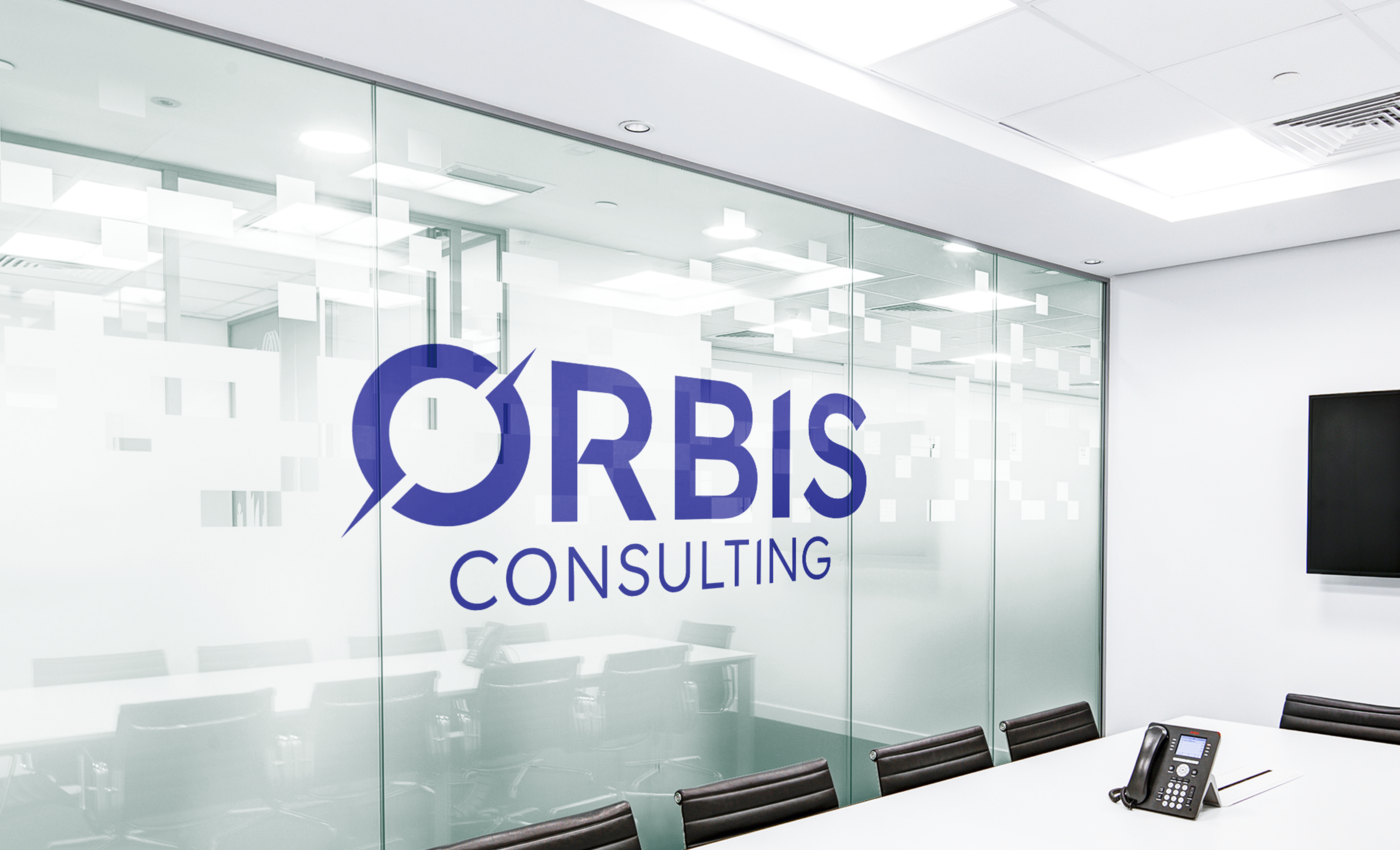
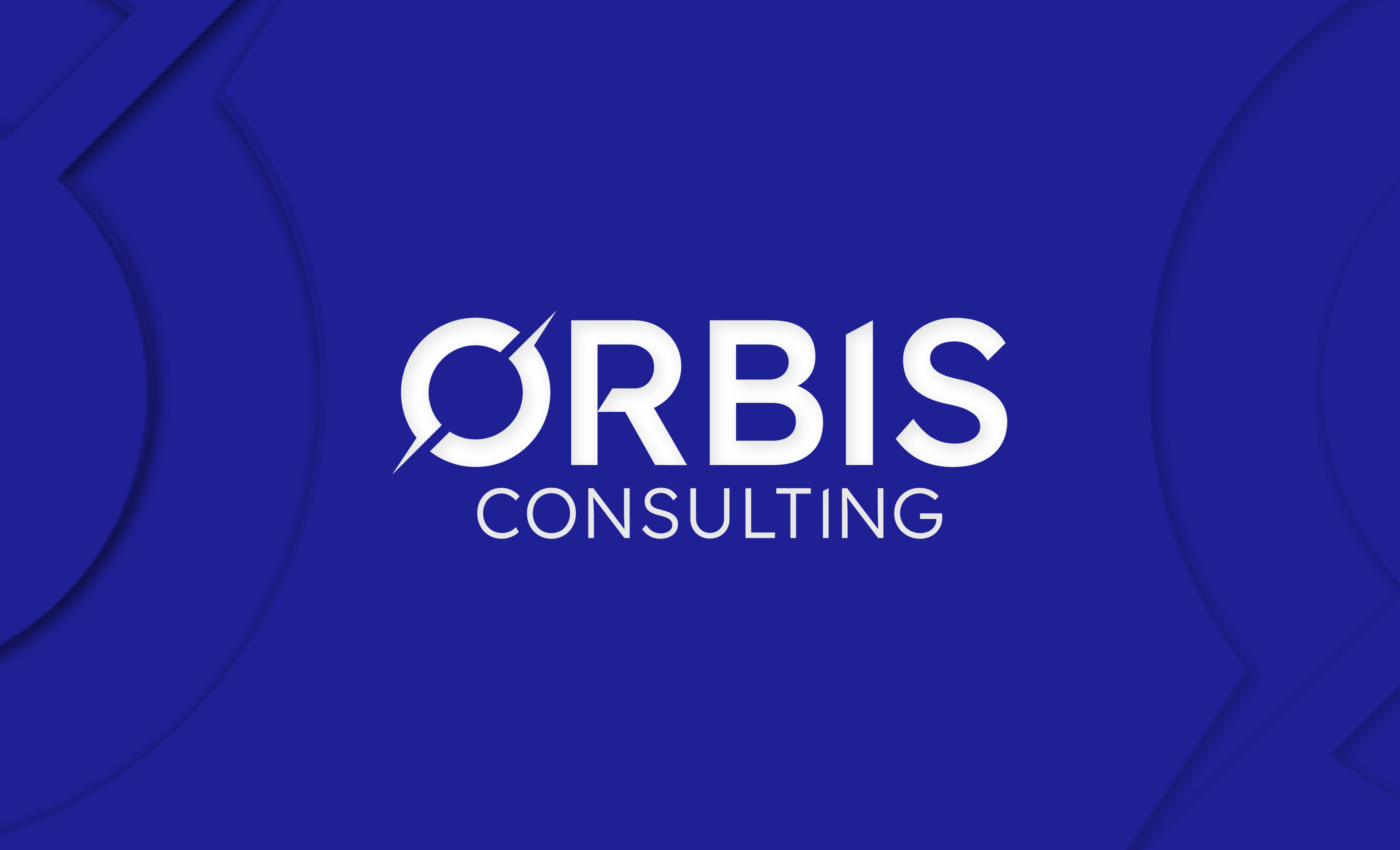
Ultimately concept 2 was selected, without any edits or changes requested. This particular logo works because it aligns with Neil's goals for his brand. As the owner of a technology business in the financial sector, he wanted a brand mark that was innovative, clean and modern. Blending these core values with an abstract compass, which fit with the name of the company, was an added bonus.
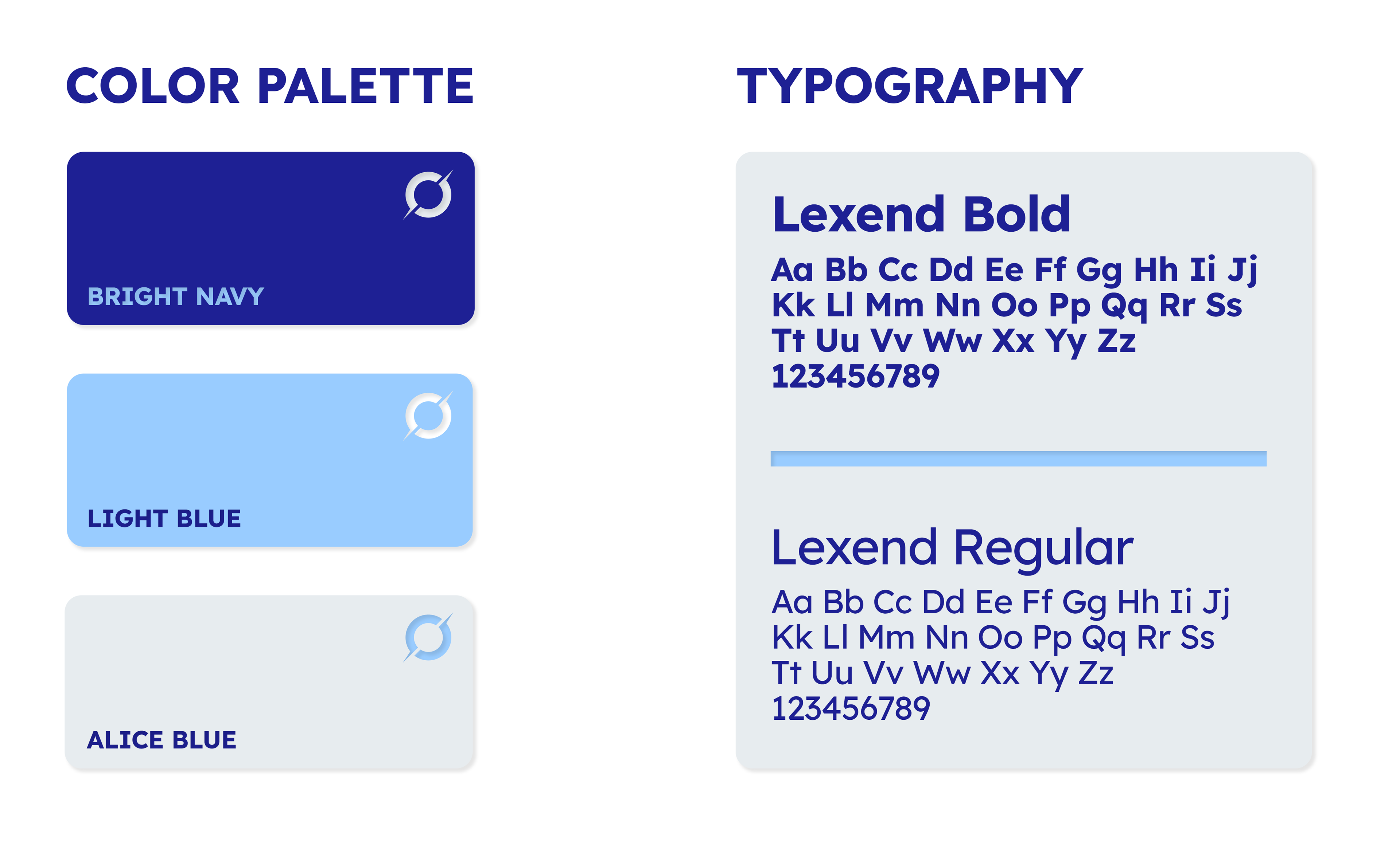
Color and Type
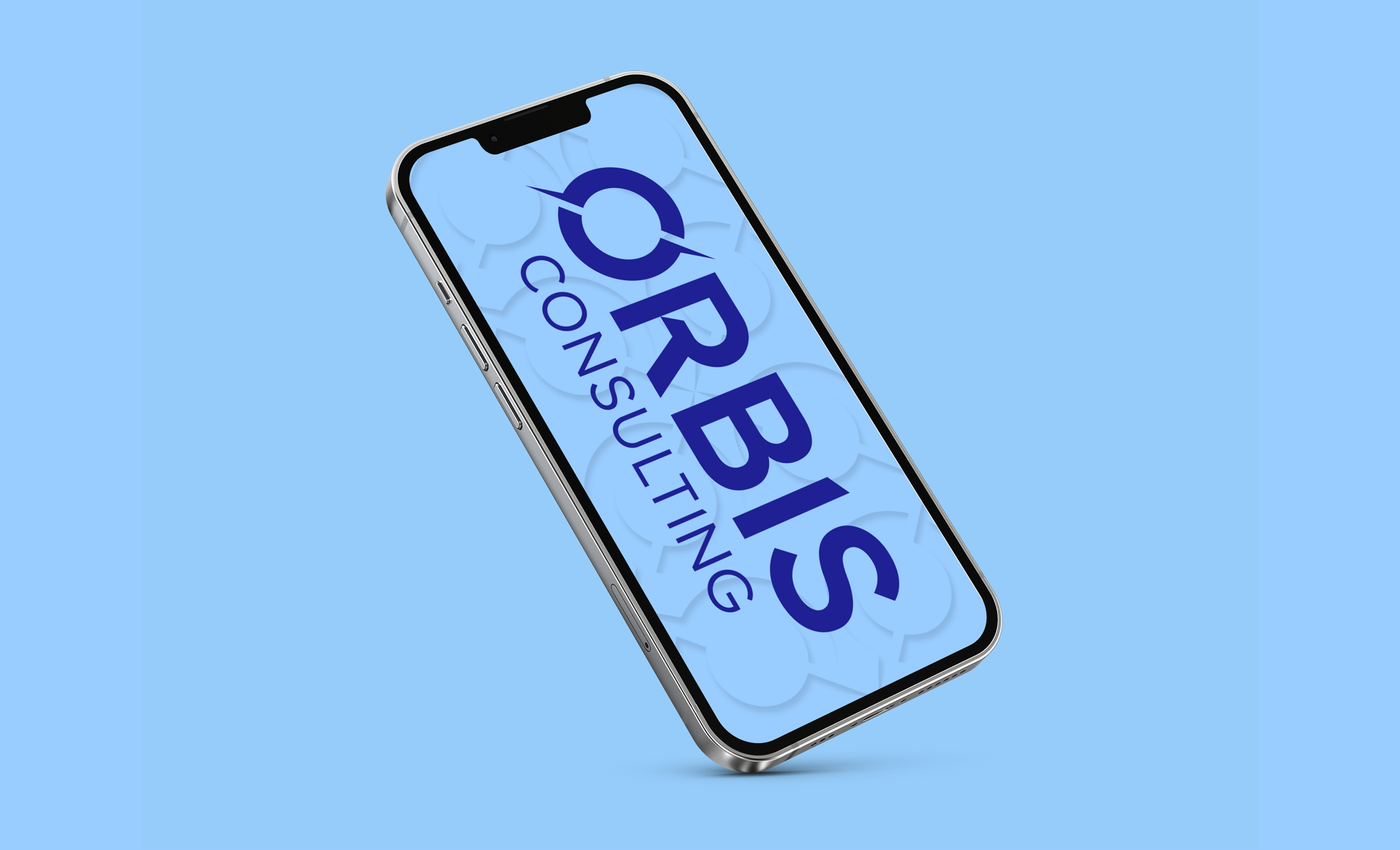
Two other critical components of the Orbis visual identity are the colors and typography. The color palette and Lexend font family communicate trust, clarity, and modern professionalism without being too stuffy or corporate.