About
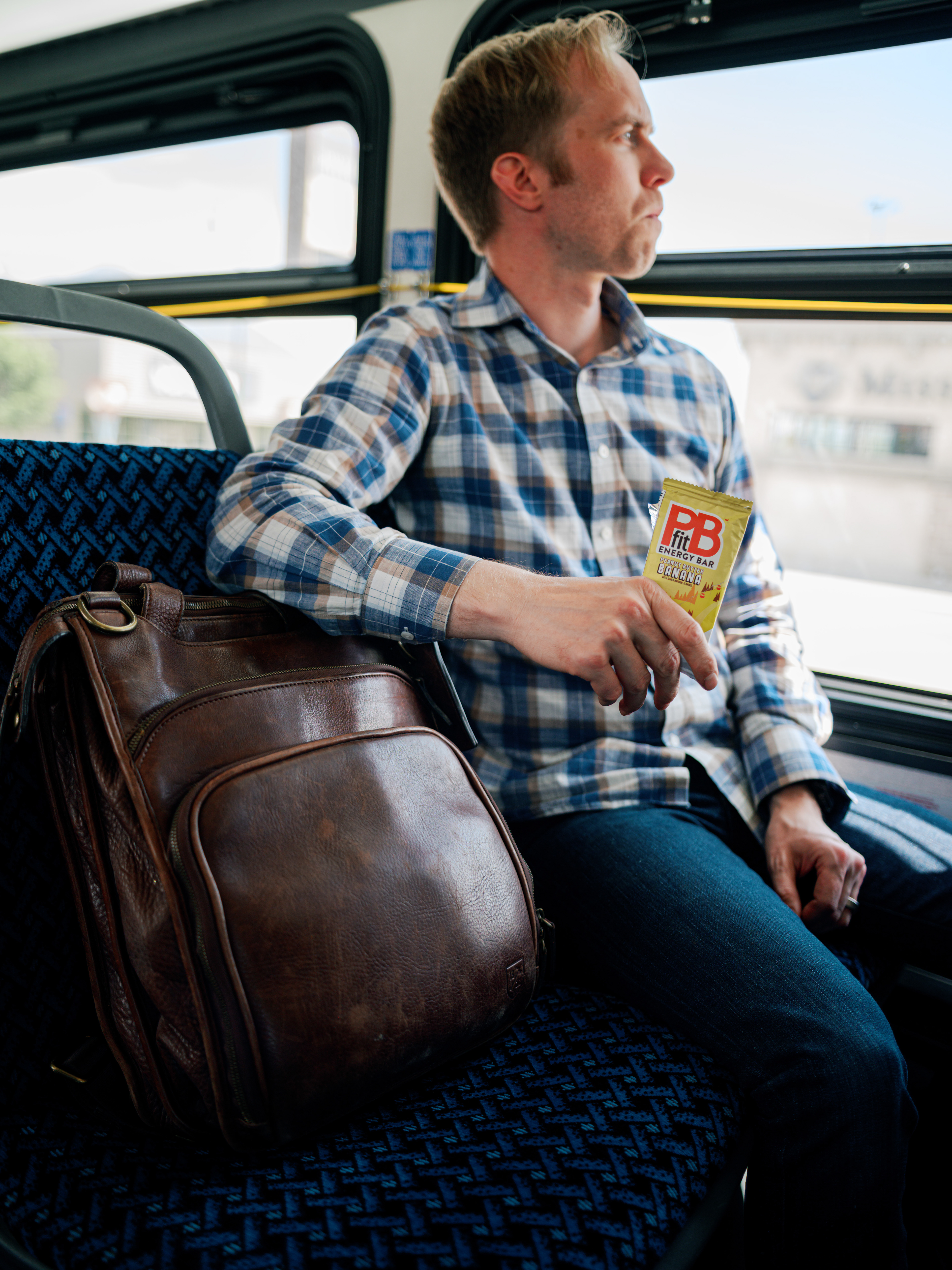
In early 2024, I was excited to learn that BetterBody Foods would be developing and releasing energy bars under the PBfit brand. These would go hand-in-hand with the protein bars that we were also developing. The goal was to create delicious Clif-style bars, with a soft texture, decadent flavors, and wholesome ingredients. As an avid consumer of Clif bars (and other granola-type bars), I gladly accepted the opportunity to design the packaging for these bars.
The Idea
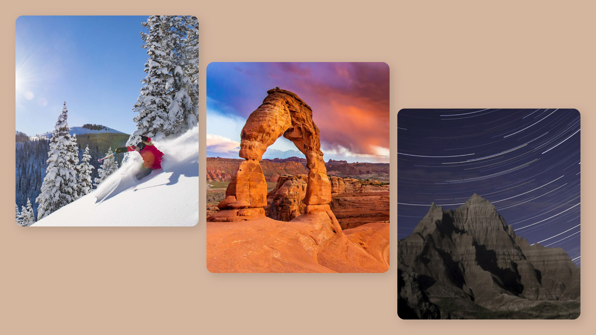
My vision for this project was to turn the beautiful landscapes of Utah into fun, engaging, memorable packaging designs. With three flavors identified by the Product Development team, I encountered my first challenge: what three landscapes would I choose? With the help of the design team, we landed on hiking Arches National Park, skiing Park City, and photographing the night sky in the Uintas.
Early Concepts
The vision to take inspiration from classic Utah activities evolved as I started designing initial concepts. The first flavor I designed was Peanut Butter.
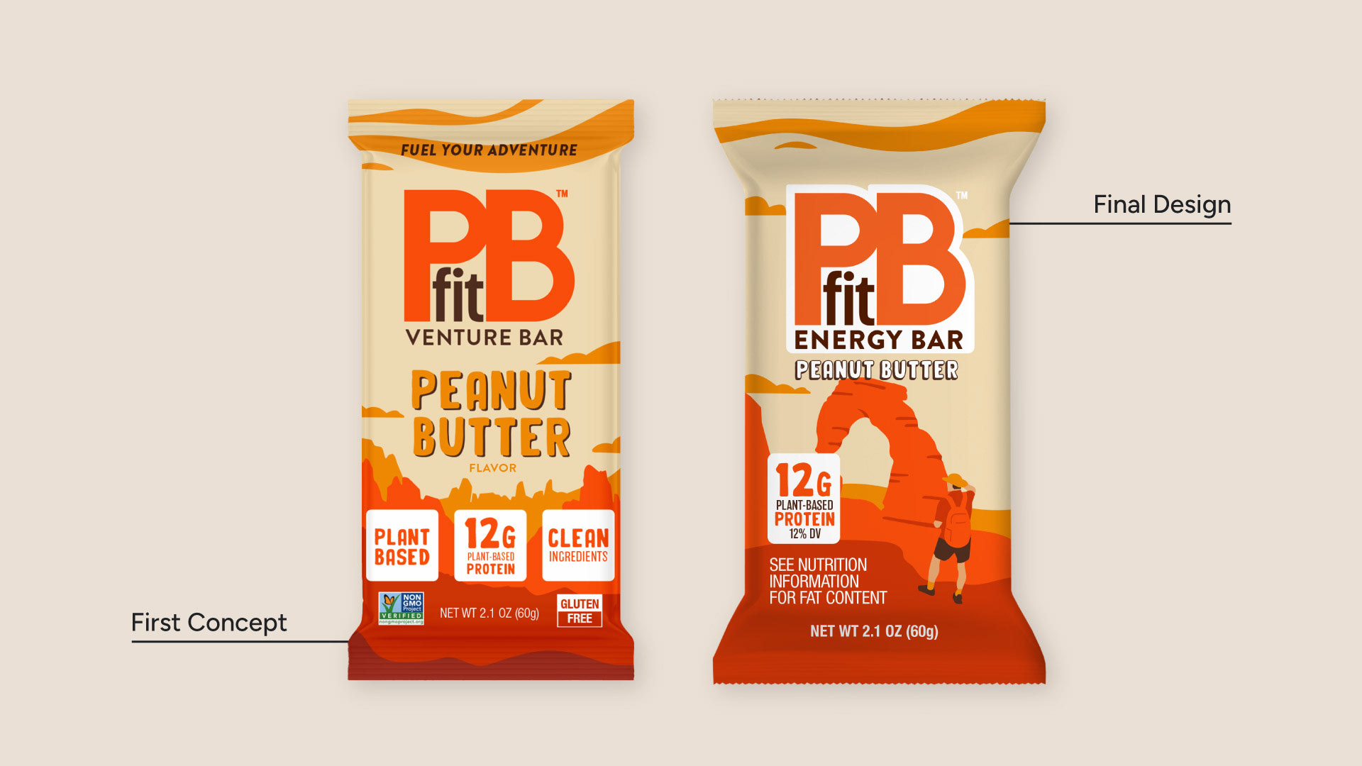
Peanut Butter
I initially focused on a more generic desert/Western theme. Though the layout was strong, I was encouraged by the team to get specific and incorporate Utah. In addition to making other regulatory and quality changes, I illustrated a design featuring Delicate Arch in the center. Due to issues with the formulation of the bar, this flavor was discontinued prior to the final print run. But I feel it’s some of my best work, and one of my favorite pieces of design.
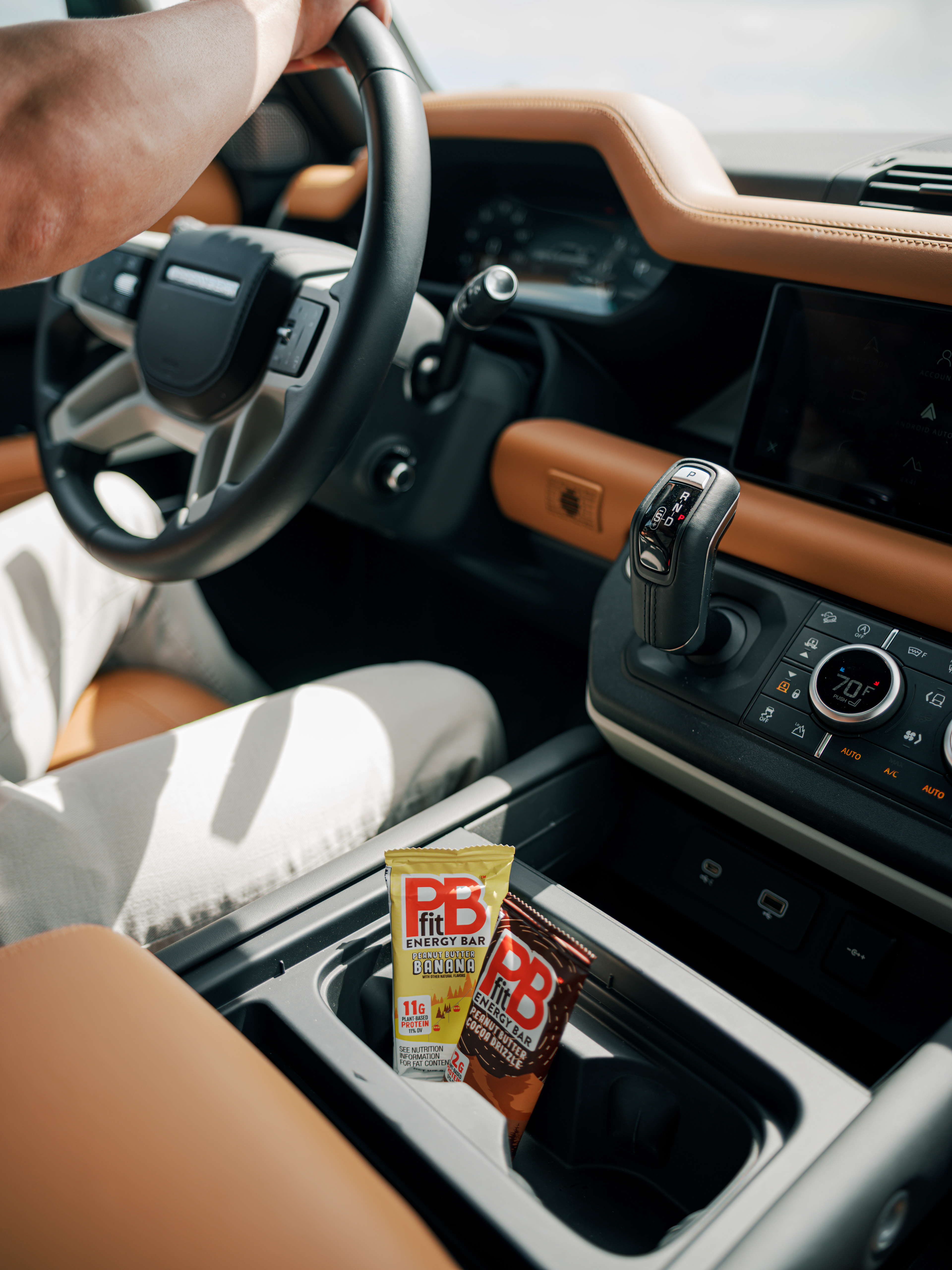
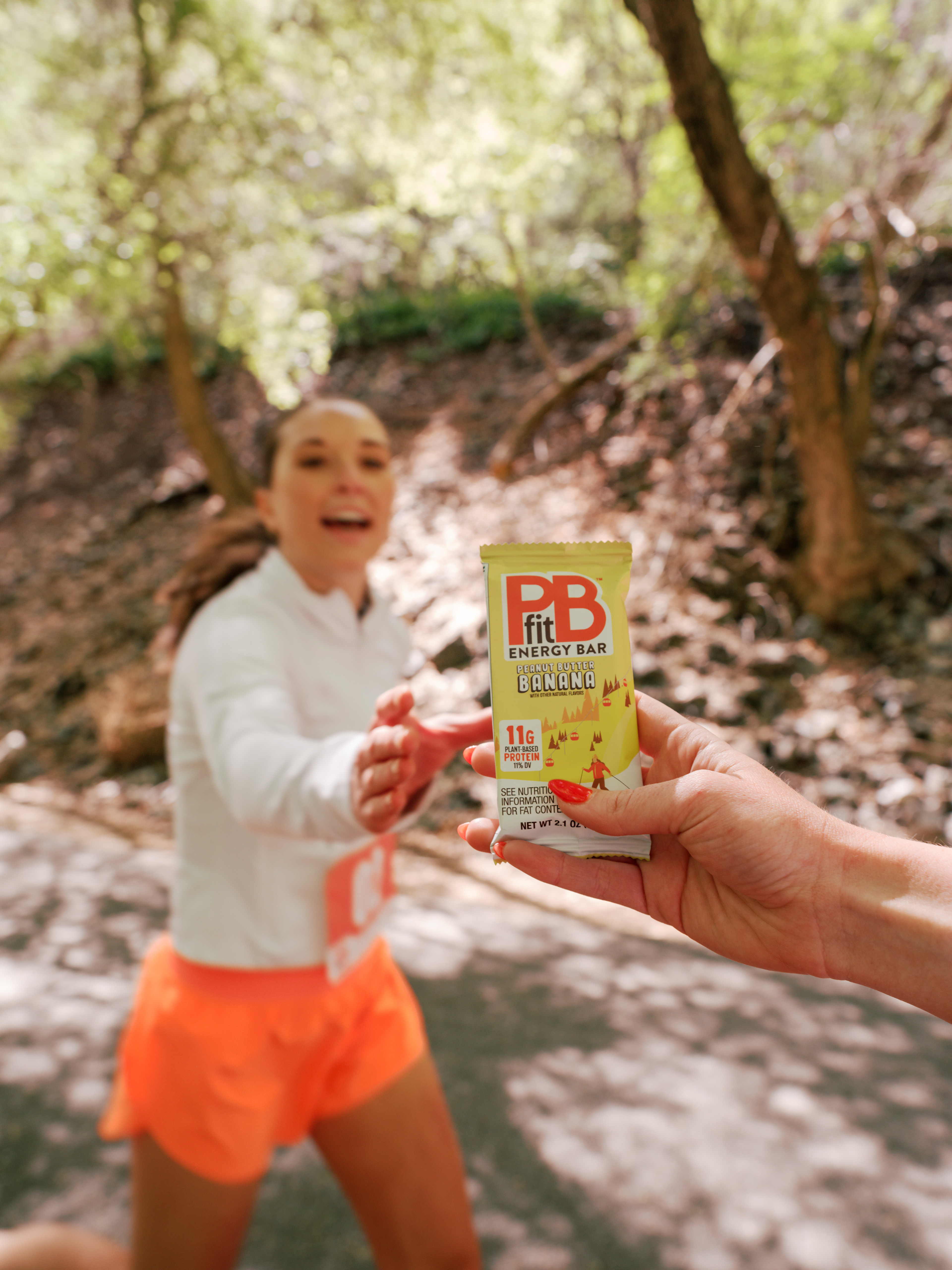
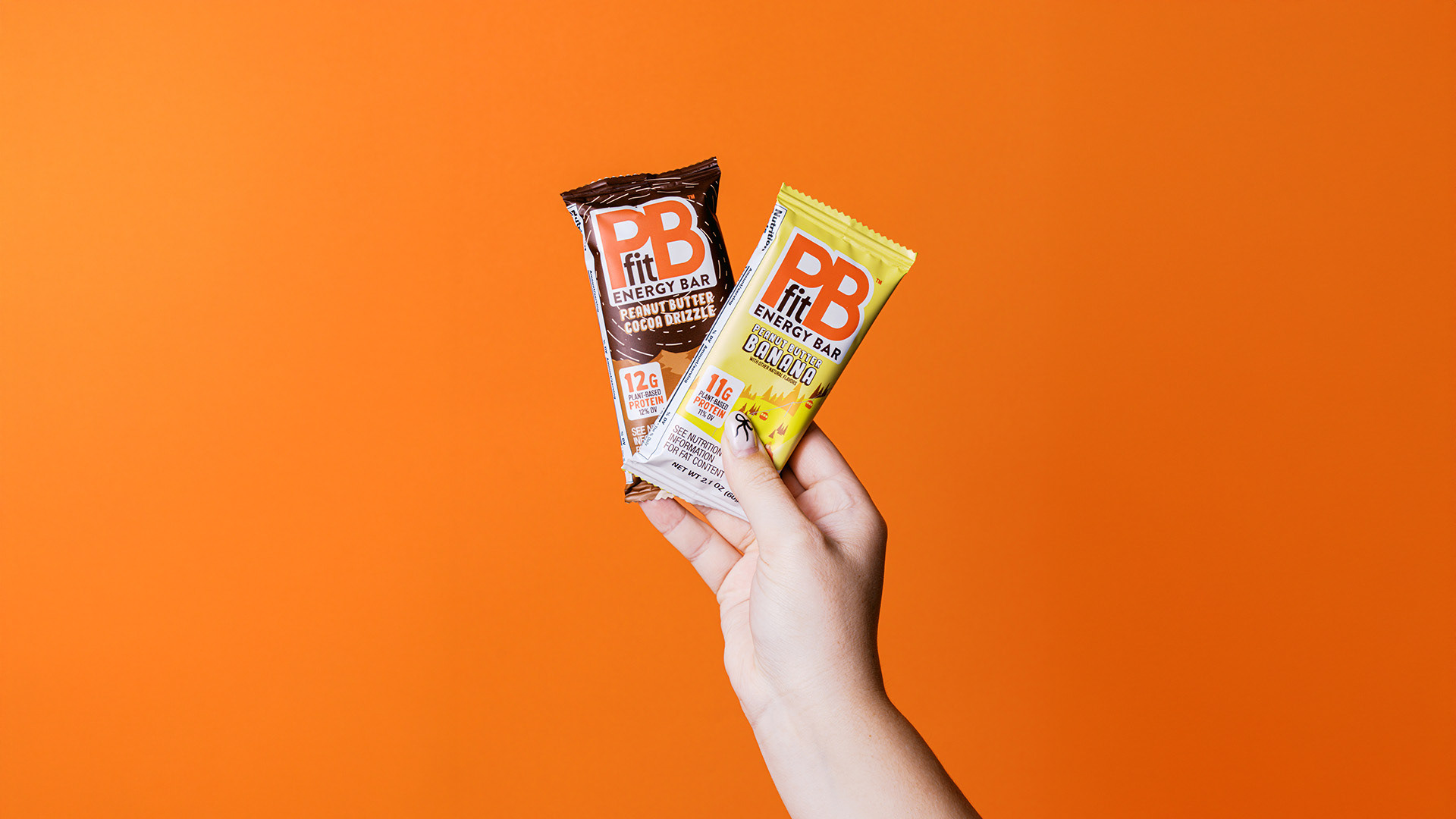
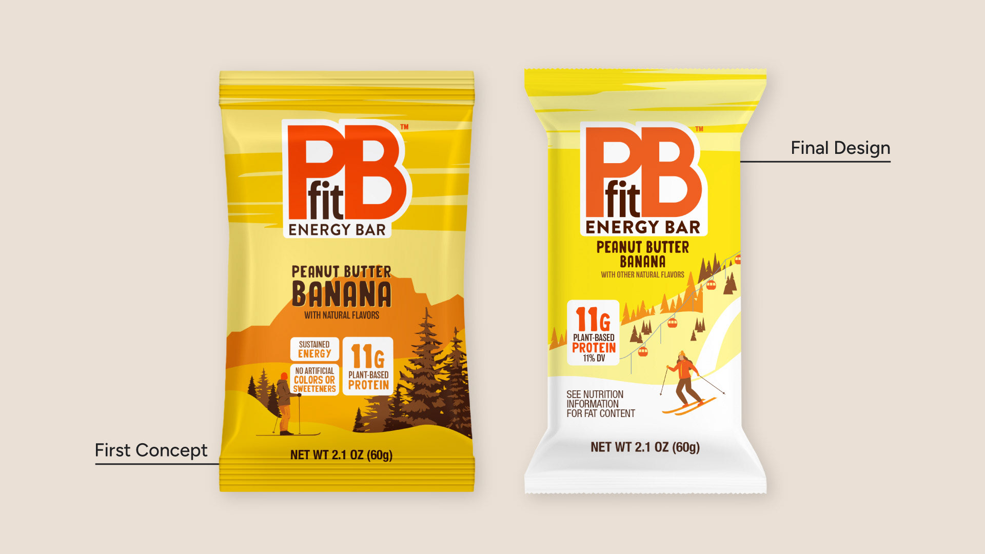
Peanut Butter Banana
My first design for this flavor featuring a cross country skier in an open field, with snow covered mountains in the background. As with the Peanut Butter flavor, I was encouraged to bring in a more Utah-specific design. That led to me creating an illustration that was inspired by Park City, featuring an active downhill skier and gondola in the background.
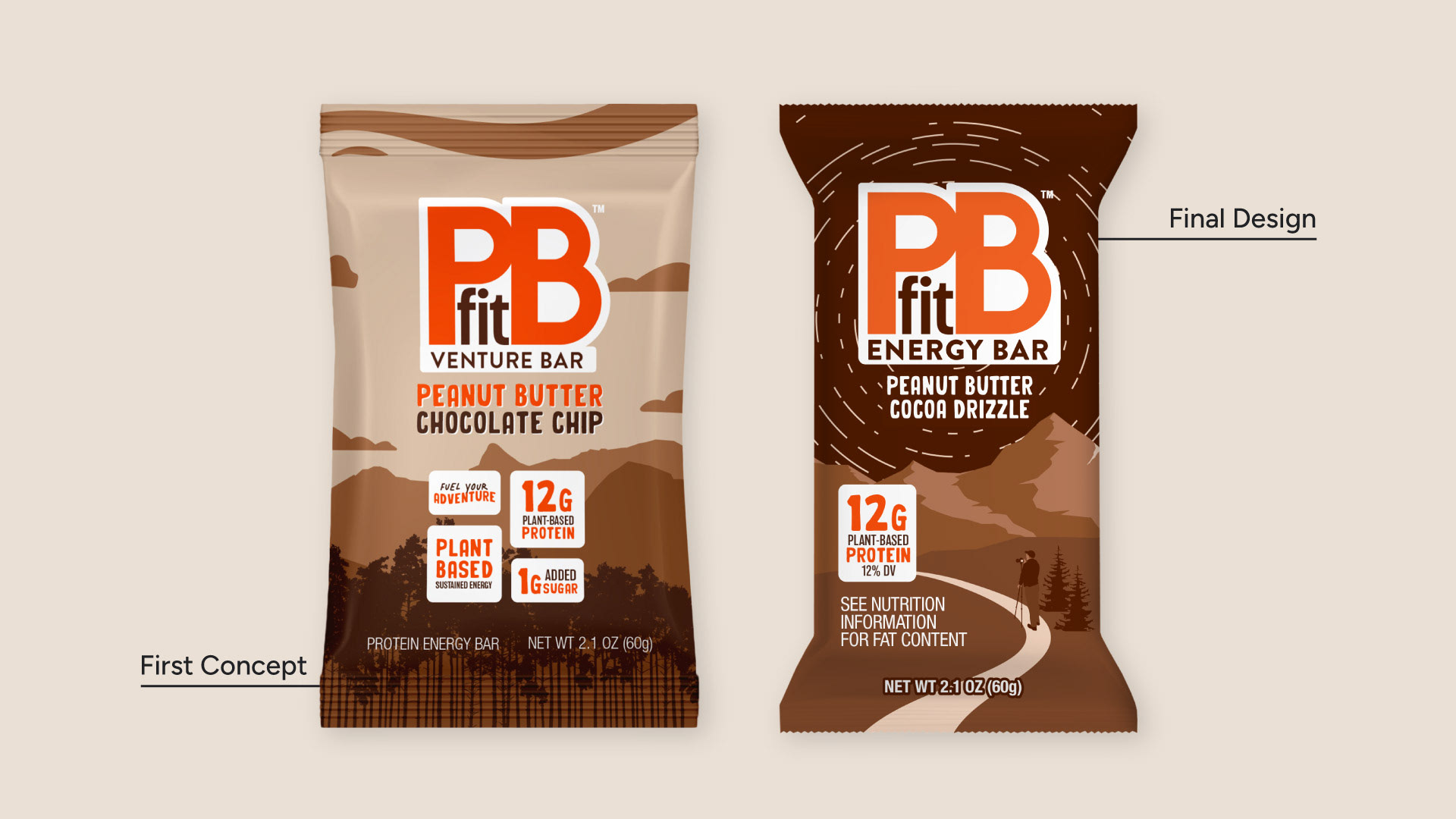
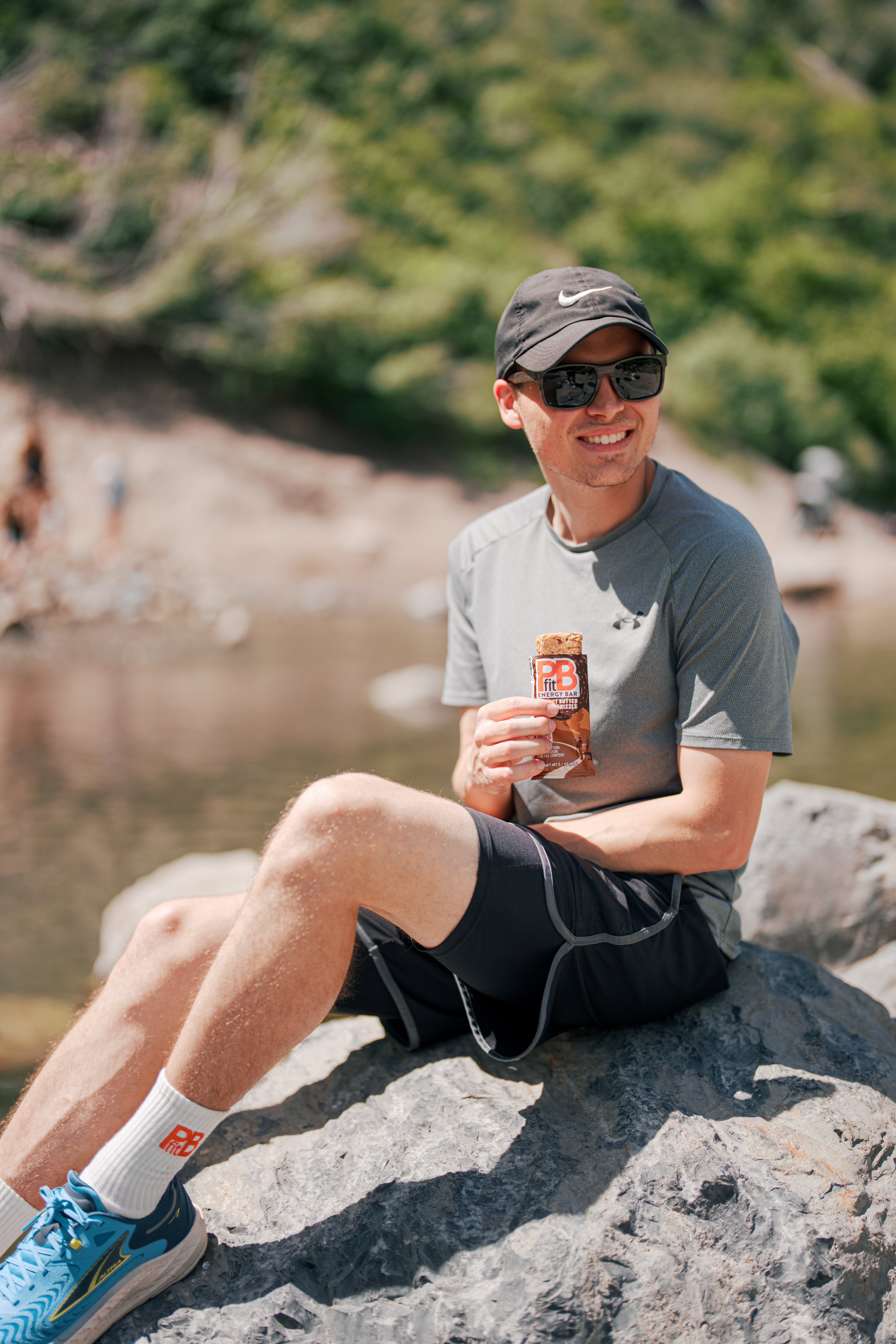
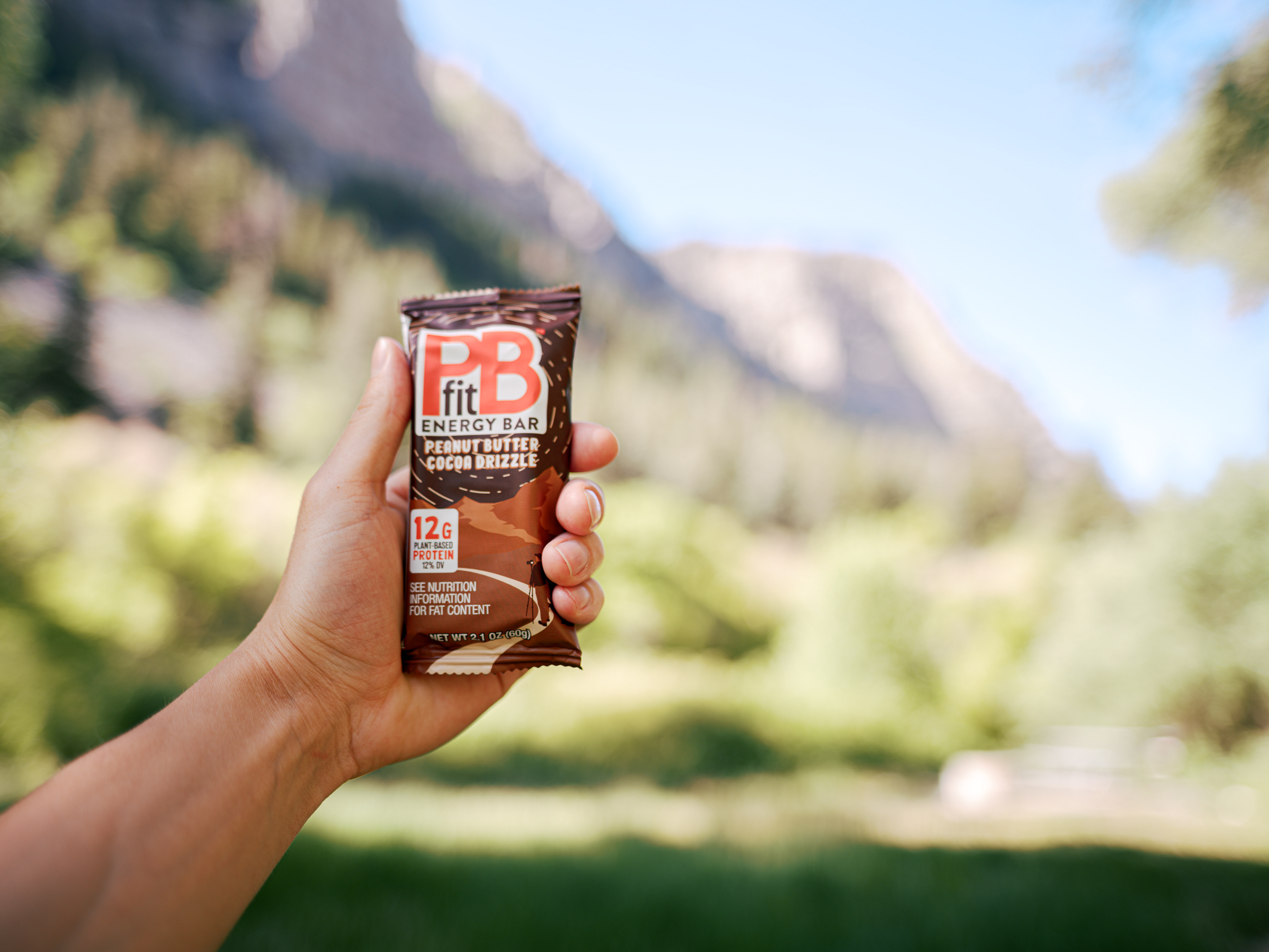
Peanut Butter Cocoa Drizzle
From the beginning of the design for this flavor, I wanted to feature an illustration of Mount Timpanogos, one of Utah’s tallest and most iconic peaks. The first iteration, however, was too detailed and lacked the personal touch that the other two flavors had. I re-worked this design entirely, now with a focus on night photography in the wilderness on the hike up to Timp. As some of my favorite night photography scenes feature star trails, I incorporated that concept into the design.
Designing Additional Assets
At this point in the process, the team made the decision to pause the Peanut Butter flavor. For the other two flavors, it was time to design 4-pack, 6-pack, and 12-pack display boxes (cartons).
Results
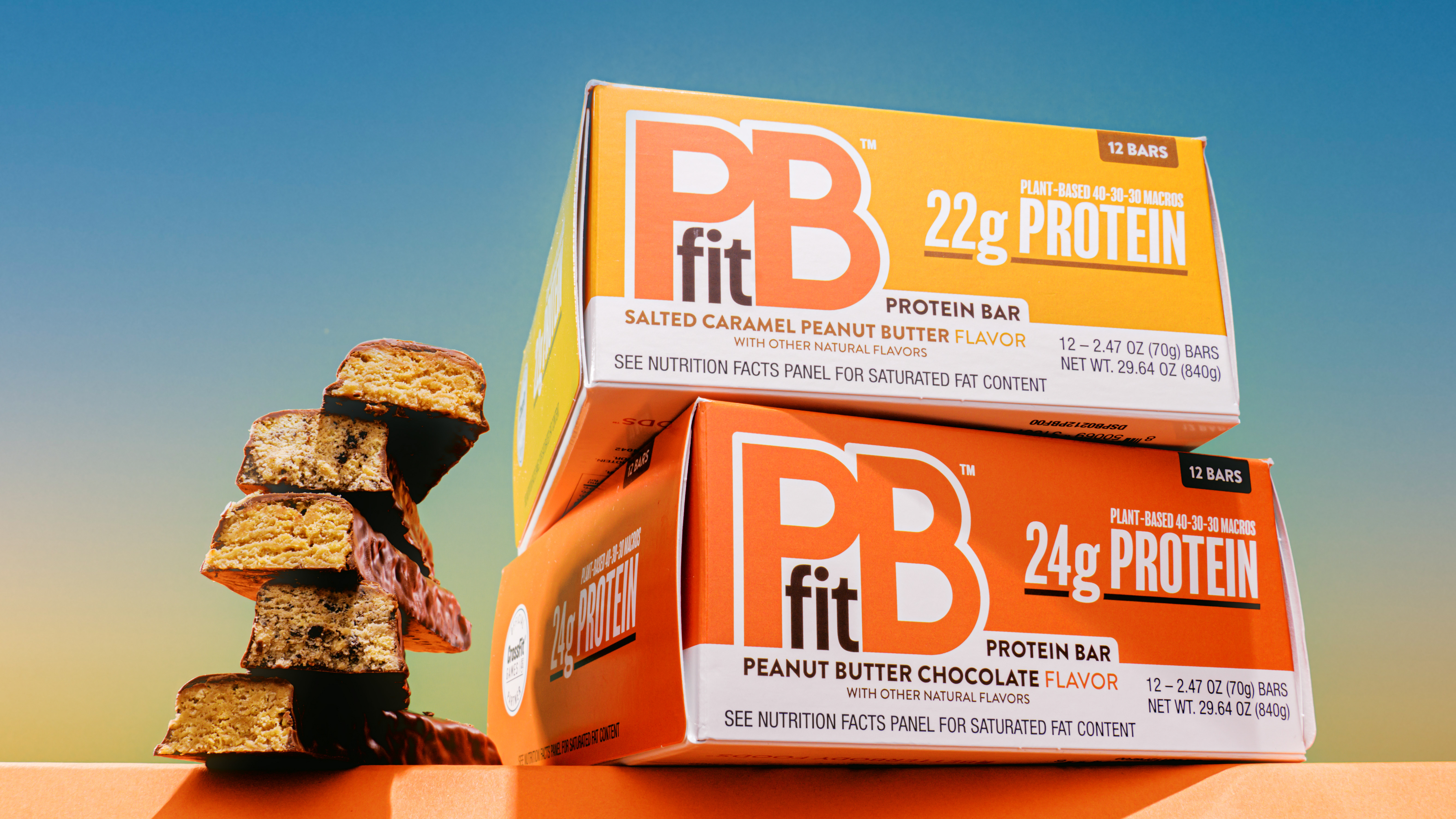
The final design is fun, vibrant, and bold. Though we did not move forward with the Peanut Butter flavor, the other two moved into final production and are available on Amazon, with in-store purchase options on the way. My vision to bring Utah-inspired designs to life wasn’t accomplished alone. It was truly a team effort to refine the designs, catch and correct errors, and ensure the labels were compliant with FDA and USDA regulations.